Difference between revisions of "XY Chart"
Gadiyedwab (talk | contribs) (→Zoom) |
Guy.yedwab (talk | contribs) |
||
| Line 38: | Line 38: | ||
Most charts show aggregate data. In XY Charts however it is often useful to show all the data points. The Explore Analytics XY Chart gives you both options. You can show data aggregated such that each point pertains to a sum or average for a category. For example, each point can show crime statistics aggregated to a city or state. You can also show all data points. This is useful for a scatter plot in which we show all the data points. | Most charts show aggregate data. In XY Charts however it is often useful to show all the data points. The Explore Analytics XY Chart gives you both options. You can show data aggregated such that each point pertains to a sum or average for a category. For example, each point can show crime statistics aggregated to a city or state. You can also show all data points. This is useful for a scatter plot in which we show all the data points. | ||
| + | |||
| + | {{Template:Visualization|Category Chart|Map Chart}} | ||
Revision as of 00:28, 26 December 2012
Contents
Overview
An XY chart visualizes relationships between numerical data and allows you to find correlations in the data. Data can be presented as a scatter plot or a bubble chart.
XY Scatter Plot
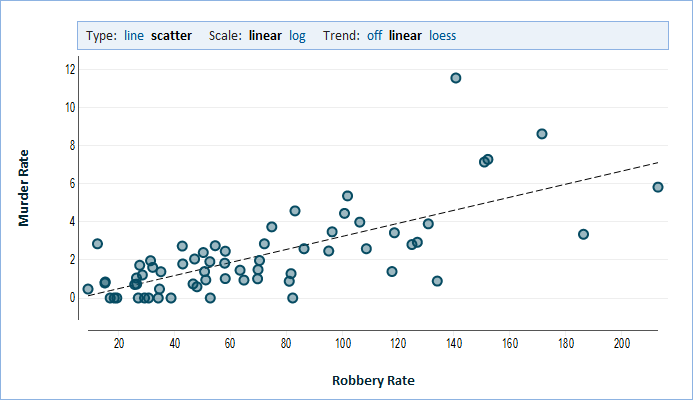
A Scatter Plot is an XY chart in which we draw data points based on two numeric values. One value determines the horizontal (X) position, and the other value determines the vertical (Y) position. We study the relationship between these two values to see if one value could predict the other because they are correlated.
A trend line can assist in seeing such a relationship.
- linear - a linear trend line is a straight line that passes as close as possible to all points (it minimizes the distance from all points). This is called a linear regression line. If the points appear to be close to the trend line, then the two values would appear to be correlated.
- LOESS - this line minimizes distance from points in its vicinity. The smooth line is not straight but rather follows the points as close as possible. This is similar to a moving-average line in a stock chart, however an LOESS calculates a weighted average in which points that are closer to the line get a higher weight than outliers (points that are distant from the rest of the data). An LOESS line can show non-linear relationships.
Bubble Chart
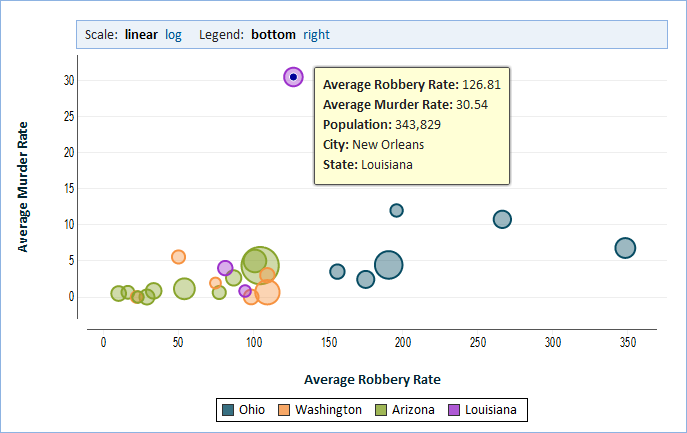
In a bubble chart we show a third numerical value. We represent this third value by varying the size of each point which we now call a bubble. We make the area of the bubble proportional to the value and therefore larger bubbles represent a larger value for this third value.
Tooltop
A "Tooltip" is the yellow rectangle that looks like a sticky note and appears next to a point in the graph to provide detail. To see the tooltip you hover the mouse over the point. On a touch device, simply touch the point for which you'd like to see the tooltip.
Zoom
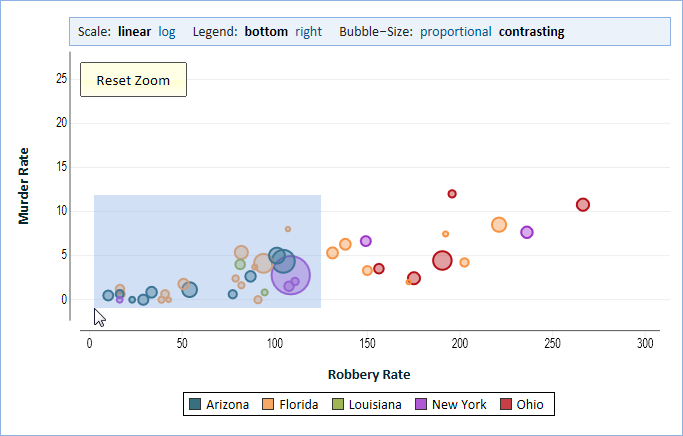
You can easily zoom on an area of the chart by selecting a rectangle in the chart viewing area. To make the selection point the mouse at the beginning of the selection and then click the mouse and drag it diagonally while holding down the button to select a rectangle. When you release the mouse button the selection is complete. On a touch device, you begin the selection by touching with your finger and then drag your finger diagonally to draw a rectangle. When you lift your finger off the screen, the selection is made. You can zoom in repeatedly to focus on smaller areas of the chart. Finally to zoom out click the Reset Zoom button.
Bubble Size
In a bubble chart you have two options for sizing the bubble. The first option is proportional. In this option the area of the bubble is proportional to its value. This is useful when showing city population as we saw in our previous example. The area of each bubble provides a true representation of the population. There are other cases however where "proportional" doesn't work well. For example, if the value ranges between 80 and 100, then using "proportional" the differences between 80, 90 or 100 would be very hard to discern visually. The second option, contrasting, shows the values at the lower end of the range (80, in our example) as the smallest bubble and the value at the higher end of the range (100, in our example) as the largest bubble. In between the radius of the bubble grows linearly with value. To summarize, contrasting maps the smallest bubble to the beginning of the range (rather than to 0) and has the radius grow linearly with the value, rather than have the area of the bubble grow linearly with the value as it does in proportional.
All Data Points
Most charts show aggregate data. In XY Charts however it is often useful to show all the data points. The Explore Analytics XY Chart gives you both options. You can show data aggregated such that each point pertains to a sum or average for a category. For example, each point can show crime statistics aggregated to a city or state. You can also show all data points. This is useful for a scatter plot in which we show all the data points.


