Visualization
Overview
A visual presentation can communicate rich and complex data quickly and clearly. A picture can often convey a trend or pattern of distribution in a way that the viewer can perceive immediately. Numerical amounts can be easily compared and related, and outliers from the norm can be easily spotted.
Explore Analytics organizes its rich set of data visualizations - its chart views - base on the type of data that they convey.
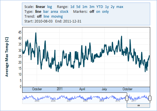
- Timeline Chart shows temporal data and focuses on the time aspect of the data to identify trends and changes over time.
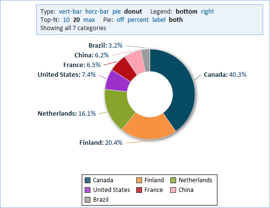
- Category Chart shows data by categories and sub-categories for comparison.
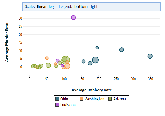
- XY Chart shows relationships between numerical variables, finds correlations and identifies outliers.
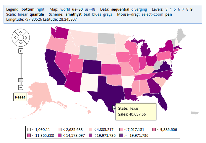
- Map Chart shows geographical data and focuses on the location aspect of the data to identify patterns and organize large amounts of data in a form that can be appreciated very quickly.
Within these broad categories Explore Analytics utilizes colors, shapes, callouts, tooltips, and legends to present the data. Information can be compared using bars and pie shapes and trends can be followed using lines and trend lines. In particular, Explore Analytics provides line graphs, bar charts, area, pie, donut, scatter, and bubble, to name the most popular types of charts.
Timeline Chart
Choose a Timeline Chart when you want to visualize temporal data to show trend and change over time. Data in the timeline can be presented using lines, bars, area, HLOC, and candlestick and you can easily switch between these presentations while keeping the overall structure of a timeline.
Category Chart
Choose a Category Chart when you want to visualize data in categories for comparison. Data in a category chart can be presented using horizontal and vertical bars, pie, and donut.
XY Chart
Choose an XY Chart when you want to visualize numerical data and find correlations. Data is presented as a scatter plot or bubble chart.
Map Chart
Choose a Map Chart to visualize spatial relationships in data by indicating data on a geographical map.


