The goal of reporting and analytics is getting answers to your questions using data. Yet one of the most surprising myths I hear echoed by CIOs and VPs is that reporting is supposed to be standardized and centralized.
To be sure, it is important to create standard metrics that the organization can use consistently.
But the idea that all of an organization’s reporting and analytics should be standardized and governed by a centralized team stifles the intelligence and curiosity required to solve problems.
Leaders throughout your organization must go beyond tracking problems and be thinking about how to solve them. This means asking new questions about the data to respond to new conditions and getting answers quickly. Problems and opportunities must be detected and understood early.
The Pitfall of Standardized Reporting
There’s nothing wrong with the idea of standard KPIs. There is clear value in measuring the organization’s performance in a consistent and transparent way.
In measuring a KPI like First Call Resolution, it is important that everyone is looking at the same definition and at the same data set to ensure consistency in decision-making. Placing one person or team in charge of these KPIs ensures that there is proper governance over reports and dashboards that must be the same for the whole organization.
But too often, we assume all of reporting is KPIs. The team who is working on the KPIs are asked to be responsible for all dashboards, and therefore all reporting tools and all reporting needs.
Over time, the team picks tools that supports those kinds of needs – tools that are focused on providing trended KPIs but don’t focus on flexible and powerful on-the-fly reporting. And access to those tools is limited to the KPI team.
Meanwhile, other leaders – if they want to seek out the answers themselves – are limited to in-app report builders or fragmented and error-prone Excel reports.
What happens if you need to answer questions quickly?
Suppose First Call Resolution suddenly declines by 15%. What do you do now?
If the answer is to delegate this question to the reporting team, you’ve got a problem.
Why Standardized Reporting Hamstrings Your Organization
For KPIs, crafting and refining standardized metrics over time makes sense.
But for the kinds of reports that solve problems, you need to be agile – and you need everyone working on solving the problems.
When the COVID pandemic arrived, a whole host of unanticipated questions showed up that needed urgent responses. How much of the team needed to suddenly work remote? What were the issues that were coming up? How was staff turning over differently? How was demand on our organization changing?
In a healthy organization, every leader is thinking about those problems and getting answers from data.
But in a culture of standardized reporting, only a few specialized people are given the permission and the tools to build those reports. The KPI Team is suddenly faced with a big stack of requests for data and reports, which they must prioritize. They may not have the direct process knowledge to fully problem solve – and they certainly don’t have the bandwidth to answer everyone else’s questions.
The result? Some questions – core business problems and urgent fires – get answered quickly. Everything else must wait. Those are the makings of a reactive organization.
Worse yet, because leaders throughout the organization aren’t used to thinking through these problems themselves, they won’t be thinking proactively. They’ll be waiting for someone else to tell them the answer.
The Better Way: Self-Service Reporting
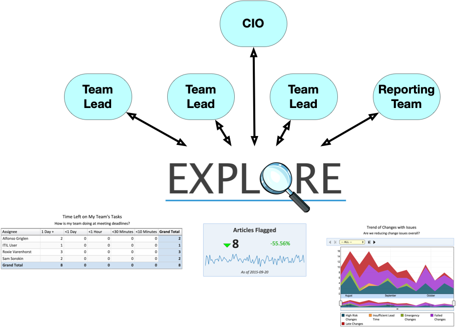
The biggest step you can take today is create a culture of problem-solving by making those kinds of ad hoc reports everyone’s responsibility. Don’t let the leaders in your organization think that someone else is responsible for running reports and answering questions. Tell them your organization expects everyone to be a problem-solver.
If you ensure that everyone has powerful and flexible self-service reporting tools at hand, they will be able to quickly pursue the answers to problems at hand.
A good self-service tool allows its users to explore the data. Users can discover the available data and proceed to explore the data to understand exceptions and trends, and answer their questions.
Then, they’ll come to meeting with the answers and solutions to problems, not just the problems.