One of the most common indicators IT use to understand workload and issues in the environment is by looking at task volumes — for example, new incidents opened by month, or new change requests by location by quarter.
The question you’re trying to answer is “Is the amount of work my organization needs to complete going up or going down?” This can help plan for future staffing or understand issues as they arrive.
However, one weakness of these kind of reports is that it can be difficult to separate the information from background noise. For example, when the number of incidents goes up, is this because of issues in the environment? Or has the organization grown in such a way that you would expect more issues?
With Explore Analytics‘ powerful mash-up and calculation capabilities, you can easily account the size of the user population to shed better understanding on your volumes. The following guide will show an example with ServiceNow on how to generate an Incidents per User report.
In order to understand the incidents per user (where user represents the number of customers or employees your organization serves), we’re going to:
- Create a report to gather the number of incidents opened this month.
- Create a report to gather the number of currently active users.
- Create a mash-up to combine those two numbers and calculate the Incidents per User KPI
The data is across two different tables (Incident and User), but you won’t need to write any code or make any database changes to get this information together.
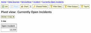
1. Create a report to gather the number of incidents opened this month
- Navigate to File > New View.
- Select your data source and table containing incidents (e.g. ServiceNow, Incident), and click Next.
- Name your view, select Pivot, and click Finish.
- Click Filter Data and filter on Opened during last 7 days. Add any additional filters if appropriate.
- Relabel the Values field to Open Incidents.
Your report should look like this:
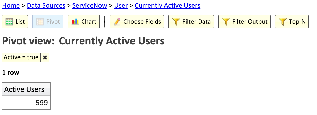
2. Create a report to gather the number of currently active users
- Navigate to File > New View.
- Select your data source and table containing users (e.g. ServiceNow, User), and click Next.
- Name your view, select Pivot, and click Finish.
- Click Filter Data and filter on Active = true. Add any additional filters if appropriate.
- Relabel the Values field to Active Users.
Your report should look like this:
3. Create a mash-up to combine those two numbers and calculate the Incidents per User KPI
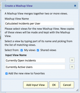
- Navigate to File > New mashup view
- Name the view, and select the two views you just created:
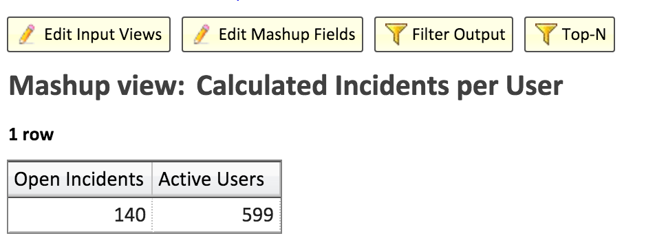
Your report will look like this:
Now, you can create the calculation. Click the Calculator icon next to the Values field, and populate the following Calculation: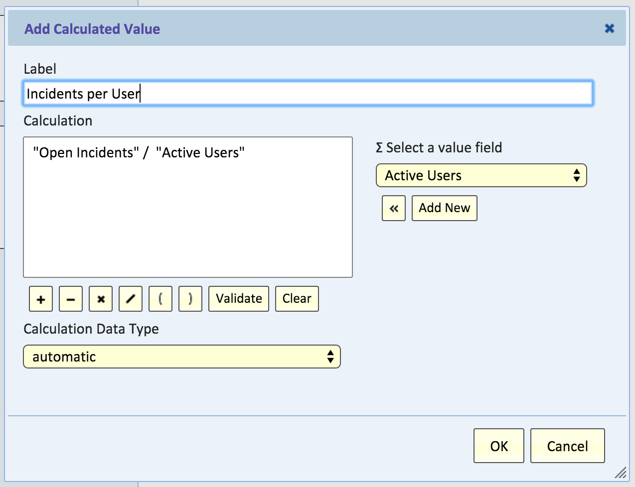
Now your report will have the incidents per user: 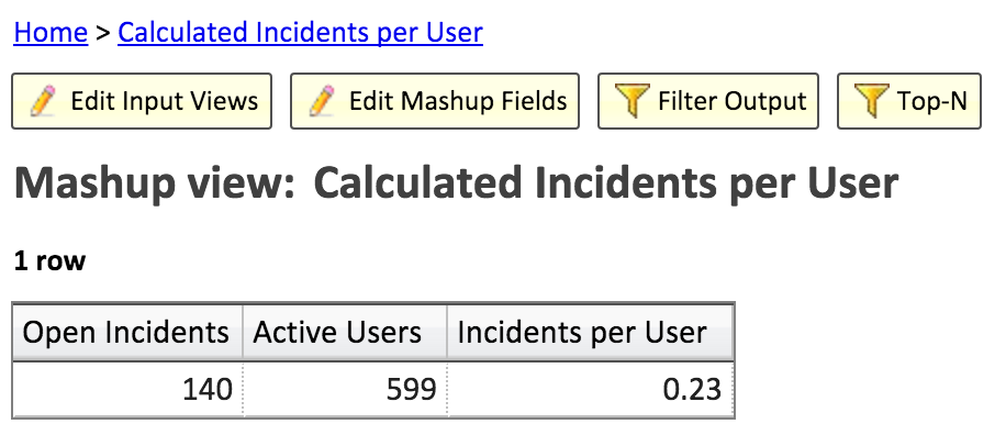
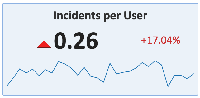
Congratulations! You now have a live view of Incidents per User!
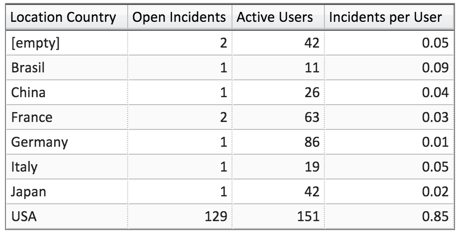
You could break this down by clicking Edit Input Views and adding additional groupings to both pivots. For example, if you group by Location.Country in both input views, you can get the Incidents per User by Country:
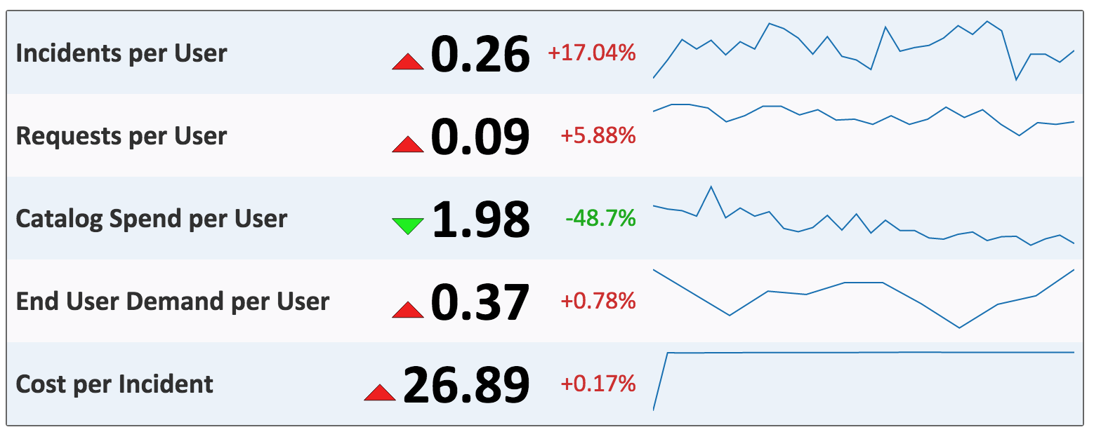
Or you can create a Scorecard, add a Track Trend, and see how Incidents per User changes over time:
Now you can explore what kind of reports you can create controlling for users!