Predictive Analysis
Introduction
Visualizing time-series data is a great way to understand
- What’s normal and what’s out of the ordinary?
- Is there a trend in the data?
- Is the trend itself changing?
- Is there seasonality to the data?
- Where are things heading based on the data?
To analyze the time series data and explore the above questions, the Timeline chart provides several tools that allow you to fit a trend line to the data and forecast that line into the future.
When performing time-series analysis, we’ll often draw the timeline chart as a line. The line connects the data points and tends to zig-zag. There’s an underlying assumption that the data has some variability around some intrinsic mean and perhaps some trend. We draw a smoother trend line and then extend it into the future.
Trend Line Options
The Timeline Chart offers the following Trend options:
- line – this trend line shows a linear regression line. This is the straight line that passes the closest to all the data points in the entire data series. This is useful for showing the overall trend, especially when the trend tends to be constant over time.
- average – this trend line shows the average value of the entire data series. This is useful for seeing when data is above average and when it’s below average.
- median – this trend line shows the median value of the data series. This is the value where exactly half the data point falls above it and half fall below.
- moving – this trend line shows a moving average. The is the average of the last “n” data points where “n” is a number that you can set. We refer to this number of data points as “periods”. For example, if your report shows weekly data and you set the moving average periods to 6, the line will show the moving average of the last 6 weeks.
- Exponential – this trend line is similar to a moving average. It uses a technique called Exponential Smoothing. It gives higher weight to more recent data and exponentially decreasing weight to older data (nevertheless it considers all the data, not just the last “n” points). We’ll cover Exponential Smoothing in greater detail in the Exponential Smoothing page.
Forecast Options
A forecast is created by extending the trend line into the future.
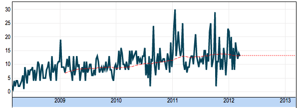
For average, median, and moving average we simply extend the average into the future. This looks like flat line and it’s based on the assumption that future data will tend to revert to the average and/or vary around the average. Here's an example:
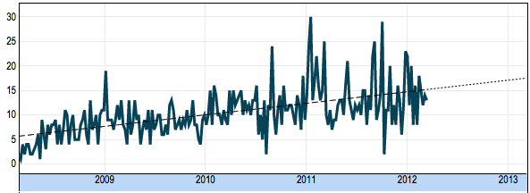
For a linear-regression line we simply continue the straight line into the future. The assumption is that future data will tend to vary around this longer-term trend line. Here's an example:
for an exponential smoothing line, we continue the line based on the type of exponential smoothing:
- Simple – similar to a moving average, we continue this line to the right as a flat line.
- Trend – the line is continued as a straight line with a slope based on the estimate of the trend. This estimate is itself based on a “moving” calculation of trend that itself uses exponential smoothing to track changes in the trend over time.
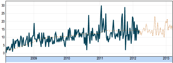
- Seasonality – the line is continued based on the average, trend, and seasonality calculated by the Exponential Smoothing.
The above forecast line with seasonality is useful if the data indeed exhibit consistent seasonality, note the predicted uptick around December 2012.
Read on for more information about Exponential Smoothing.


