Dashboard
Contents
Introduction
A dashboard groups together multiple views onto a single page. A dashboard can be published and shared. A dashboard can contain Slicers that allow the user to make selections and have those selections apply to parameterized views on the page.
Additionally, a dashboard can contain Rich-Text and Image items. Text and images is important for annotating the dashboard for information that helps the user interpret the dashboard and helps the dashboard "tell the story" to convey its information.
Note: The dashboard functionality is only available with an Enterprise Plus subscription.
Creating a Dashboard
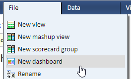
To create a dashboard, select “New dashboard” from the file menu and give the new dashboard a name (title). An empty dashboard is created and you can then add views and slicers to the dashboard.
Dashboard Layout
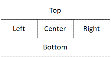
The dashboard has a layout consisting of five drop areas: top, left, center, right, and bottom. If the dashboard has tabs, each tab has their own five drop areas.
In addition, there's a "global" drop area above "top". If the dashboard has tabs, items placed in the "global" drop area are shared across all tabs.
There are no visible borders between the drop areas. In fact the drop areas themselves are invisible, only contents within the drop areas are visible. Drop areas can be left empty and empty drop areas do not take any space on the dashboard. Therefore, a two-column layout can be created by simply using two of the columns, for example, using the left and center and leaving the right empty.
Responsive Layout
The dashboard layout is responsive to screen size. On small screen (such as a phone), a multi-column display will change into a single-column display. In that case, the views in the center area will be displayed below the views in the left area.
Sizing the column widths
by default, horizontal space is allocated to the columns evenly. For example, if all three columns are used, each column will occupy one third of the width of the dashboard. If two columns are used, then each column will occupy half the width of the dashboard.
You can customize the widths. For example, you can make the center column wider. This customization is done for a specific tab on the dashboard (see tabs below). If your dashboard does not use tabs, then in effect it has a single tab even though the tab selection is not shown.
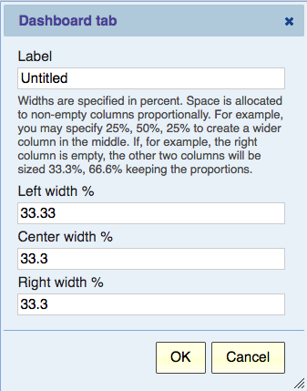
The Tabs button brings up the Dashboard Tabs dialog. Click Edit on the tab that you want to customize and then you can set the width of each column as a percent.
Although you specify three widths, space is only allocated to non-empty columns proportionally. For example, you may specify 25%, 50%, 25% to create a wider column in the middle. If, for example, the right column is empty, the other two columns will be sized 33.3%, 66.6% keeping the proportions.
Note that percentages don't need to add up to 100%. You can specify 40%, 60%, 40%. This will give you a 40/60 split if you use two columns. If however you use all 3, the space will be allocated proportionally as 28.6%, 42.8%, 28.6%.
Adding a View to a Dashboard
Use the “Add View” button to add a view to the dashboard so that the view will display in the dashboard.
It is important to note that the view remains independent of the dashboard. Deleting the dashboard does not delete the view and making a copy or publishing the dashboard does not copy or publish the view. The dashboard merely displays the view.
It is also important to note that the dashboard can only display published views. This means that if you later want to modify the view, you’ll need to re-publish it to update the published version of the view that’s displayed in the dashboard.
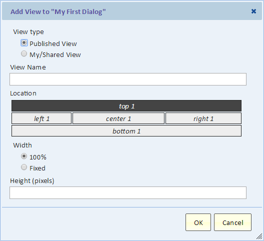
This is the “Add View” dialog. Next, we’ll describe all the selections on the dialog in detail.
View Type
As we mentioned before, only published views can be displayed on the dashboard. If you select a “My/Shared View”, you can select one of your personal views or a shared view. In that case, a published version of the view will be created and the published version of the view will be added to the dashboard.
View Name
Type part of the name of the view to look it up, and then select from the autocomplete list to select the view.
Location
By default, the new view will be added as the first item in the top drop area. You can select other locations for the view to be displayed.
Width
Setting the width to 100% will automatically size the view to the width of the drop area. For example, in a three-column layout, this may be one third of the width of the screen and in a single-column layout, the entire width of the screen.
Height
By default the height is automatic. For list, pivot, and scorecard, it means that the height is adjusted to contain the view plus a small margin at the bottom. For charts, the height is calculated to maintain an aspect ratio to the width and the height is adjusted to contain the chart plus a small margin at the bottom.
You can select a fixed height and set the desired height of the view in pixels.
On a published dashboard, auto-refresh this view periodically
This option only apply to the dashboard that's published from this dashboard.
You can set the view to automatically refresh every few minutes. The minimum setting is 1 minute. This option is useful for views that show data that changes often. It's useful on dashboards that are displayed in the manner of a slide show such as on a monitor mounted on a wall.
If both the dashboard and this item are set to auto-refresh, the setting on this item (this view) overrides the dashboard setting for this view.
If the view is on a table that's not currently showing, the view be refreshed when the tab becomes visible (for example, when the user switch over to the tab).
Acting on a Dashboard View
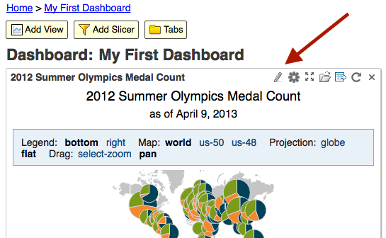
A view is displayed on a dashboard inside a frame that includes the name of the view in the top-left corner and several icon buttons on the top-left. Those icon buttons allow you and in some cases the user viewing a published version of this dashboard to act on this view.
- The pencil icon allows you (the person editing the dashboard) to go to the view from which the dashboard view was published. If you edit that view, remember to publish it again to reflect the changes in the dashboard.
- The gear icon allows you (the person editing the dashboard) to edit the settings for the display of this view on this dashboard (see editing settings below)
- The full-screen button allows any person viewing this dashboard to open the view in a new browser tab thereby displaying it using the entire browser tab.
- The open button lets you go to the published view. From there you can make a copy of the view, for example.
- The export button lets you export the data that's currently showing into a file in CSV format.
- The reload button lets you reload the view.
- The close button allows you to remove this view from the dashboard. For someone who’s not authorized to edit this dashboard, the button will temporarily remove the view from the display, but that change will not be saved.
Publishing a Dashboard
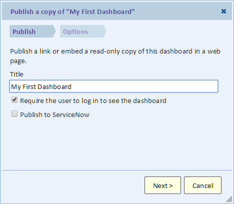
When a dashboard is published, a read-only copy of the dashboard is created. The published dashboard contains copies of any slicers that are part of the dashboard being published. However, views are not copied and the published dashboard displays the same views as the dashboard being published. To publish a dashboard, select “Publish” from the “File” menu.
Require the user to log in to see the dashboard
Normally, users must be logged in to view dashboard. If you check this box off, the user will not be required to login to access the dashboard and interact with the slicers. However, they will still be required to login to see the views unless the view itself was published without requiring login.
Publish to ServiceNow
Publishing to ServiceNow creates an iFrame Content Block in ServiceNow that can be placed on any Home Page, Portal page, or CMS page.
Another way of adding an Explore Analytics dashboard to ServiceNow is as a Module with a link type of URL.
Adding a Slicer to a Dashboard
A Slicer allows making selections that control the data displayed in dashboard views via the use of View Parameters. This functionality is described in the Slicer and the View Parameters pages respectively.
Tabs
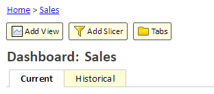
Tabs allow you to organize the views in your dashboard. Instead of showing a large number of views on a single page, you could organize them into several tabs, each with a small number of views. Benefits of organizing your dashboard into tabs:
- Tell the story. For example, by separating views that show “current” perspective from views that show “historical” perspective you can help narrate and tell the story.
- Improve performance. When the dashboard is loaded, only the views for the first tab are loaded. This means that the dashboard loads faster. Only if and when the user goes to another tab do those views load.
- Slicers work better. With tabs it’s easier to see which slicers affect which views.
Creating a Tab
Use the Tabs button to give the first tab a title and to create additional tabs. When a new tab is created, it starts off empty. You can select the newly created tab in the dashboard and then Add View or Add Slicer to add content to the tab. To move a view from one tab to another, simply add the view to the other tab using Add View and remove it from its previous location. When you add Slicer to a tab, the slicer only affects views on that tab.
Duplicating a Tab
Use the Tabs button to display the list of tabs. Highlight and tab and then click the "Duplicate..." button. A new tab is created by copying the selected tab. You should edit the tab to give it a new label. The new tab will have its own copy of any slicers. You can then edit the new tab by adding or removing views, for example.
Removing a Tab
Use the Tabs button to display the list of tabs. Highlight and tab and then click the "Remove..." button. The tab and all its content will be deleted.
Re-ordering Tabs
Use the Tabs button to display a list of the tabs and allow you to re-order tabs by dragging items in the list. To move a tab to a new position, drag the corresponding item in the list to the new position.
Adding Rich Text to the Dashboard
A Rich Text item contains rich text. The text may contain images and hyperlinks. The text may offer the user additional information to explain the information that's displayed in the dashboard. To create a Rich Text item, click the "Add Rich Text" button that's above the title (below the breadcrumbs). Select the drop-area for the item and click "Edit" at the bottom of the dialog to edit the rich text.
Editing a Rich Text item
When you hover the mouse over the item or when you touch the item (on a touch device), the "Edit Settings" and "Remove" buttons appear at the top-right corner of the item. Use the "Edit Settings" button (looks like a gear) to edit the item. You can then change the item location and size, and you can edit the text using the "Edit" button at the bottom of the dialog.
Removing a Rich Text item
When you hover the mouse over the item or when you touch the item (on a touch device), the "Edit Settings" and "Remove" buttons appear at the top-right corner of the item. Use the "Remove" button (x) to remove the item. This operation cannot be undone.
Dashboard Hyperlinks
A dashboard hyperlink allows you to create a link between a list view in one tab and another tab that provides details.
Creating a Dashboard Hyperlink
A dashboard hyperlink is created manually by typing it in.
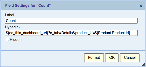
Assuming a list view in a dashboard tab, open the view for editing, in the fields dialog on the left, select a field and open the field settings dialog to add a hyperlink.
Type in
${ds_this_dashboard_url}?s_tab=
Followed by the name of the tab that will provide the details, then followed by parameters in the form ¶m=value
For example:
${ds_this_dashboard_url}?s_tab=Details&product_id=${Product Product Id}
This example will create a link that once clicked, will open the "Details" tab and pass a parameter to it (the same as a slicer does). In our example, the parameter name is "product_id" and as value we pass the value of the "Product Product Id" field.
Remember to publish the view so that the dashboard will be updated with the updated view and its new hyperlink.
Creating the Dashboard Hyperlink Target
In another tab (for our example, the "Details" tab), create a view that would show the details. This can be any type of view (e.g., chart). The view can have parameters that match the parameters passed by the URL. Then when you click on the URL, the view will show information based on the selected parameter value.
Adding an Image to the Dashboard
An Image can be a logo, icon, picture or any other image that adds to the dashboard. An image item has control over the size of the image. For example, you can have the image automatically sized to the width of the drop area. You can keep the image original size, or you can specify the size in pixels. If you only specify the width, the height will automatically keep the correct aspect ratio of the image.
To create an Image item, click the "Add Image" button that's above the title (below the breadcrumbs). You can add an image that's hosted elsewhere on the web by specifying its URL web address. In this case, the image will not be copied or stored in Explore Analytics. The dashboard will display the image from where it's hosted. Alternatively, you can upload and image and store it in Explore Analytics. The dashboard will then retrieve the image when it's displayed in the dashboard.
Editing an Image item
When you hover the mouse over the item or when you touch the item (on a touch device), the "Edit Settings" and "Remove" buttons appear at the top-right corner of the item. Use the "Edit Settings" button (looks like a gear) to edit the item. You can then change the item placement and size.
Removing an Image item
When you hover the mouse over the item or when you touch the item (on a touch device), the "Edit Settings" and "Remove" buttons appear at the top-right corner of the item. Use the "Remove" button (x) to remove the item. This operation cannot be undone.
