Witness the ultimate data visualization experience. Choose any of the following examples to test-drive the interactive charts produced by Explore Analytics.
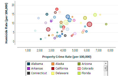
This XY chart shows the relationship between two crime rates, homicide and robbery. Each point corresponds to one of the 50 states. This type of chart is called a bubble chart. It uses the size of each point to indicate a third numeric value, in this case it's the population of each city.
The chart is animated along the time dimension allowing you to see at once the changes in all 50 states over the 51-year period.
Click the chart to interact.
When you reach 2010, hover over the outlier point at the top right to see which state it is. Zoom in on an area of the chart by selecting a rectangular area by dragging the mouse or your finger if you're using a tablet.
Data provided by the FBI.
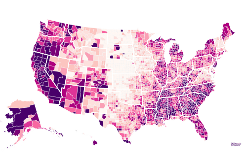
This map chart of the United States is colored by county by unemployment rate. The darker color indicates a higher rate of unemployment and the lighter color indicates a lower rate. You can quickly see which areas of the country suffer higher unemployment. Data is as of end of June 2012 using preliminary numbers from the U.S. Bureau of Labor Statistics.
This type of map chart is called a choropleth.
The author of this chart chose to use 9 color levels and assign them by quantiles. This means that the top ninth of counties with the highest unemployment are assigned the darkest color. Try changing some of the settings to see their effect.
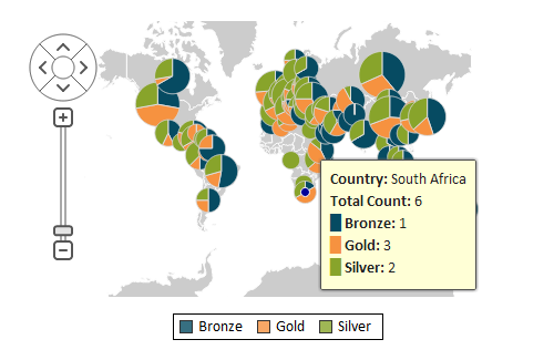
This map chart of the world has a pie chart for each country that won medals at the 2012 Summer Olympic Games in London. The size of the pie is proportional to the total number of medals and the pie shows how the medals divide between gold, silver and bronze.
Zoom in and pan over to your part of the world to focus on the countries of interest. Hover the mouse over each pie or touch it on a tablet to see the details.
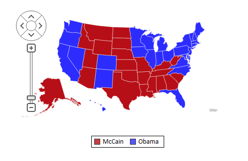
Red states and blue states are depicted using a choropleth map chart. This map is colored by category rather than by a numeric value. The category is the name of the candidate who won each state. You can see that President Obama won by winning the more populated states (with the exception of Texas).
Hover the mouse over each state or the District of Columbia to see the number of electoral votes that went to each candidate.
Earthquakes of magnitude 2.5 or higher are depicted using a map chart indicating points on the map by latitude and longitude. The size of each point (bubble) on the map is proportional to the earthquake's magnitude on the Richter scale. The data is for just 7 days ending August 16, 2012. The data was downloaded from the U.S. Geological Survey website.
We color points by day to show earthquakes that happened on the same day using the same color.
The map shows frequent activity in the area of the Aleutian Islands in Alaska. Try zooming on that area and hover the mouse over each earthquake to see additional details such as the name of the place and the depth of the earthquake in kilometers.

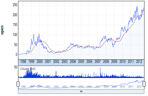
The timeline chart borrows many capabilities of interactive stock charts, but it can be used for any kind of data that's based on date and time. This makes the timeline chart the most popular chart for showing trends. In this example we show stock price data for Amazon.com Inc.
We show historical weekly prices since the Amazon.com IPO through the dot.com boom and bust and all the way to August of 2012.
Try zooming on a date range and scrolling through the timeline using the sizer and slider at the bottom of the chart.
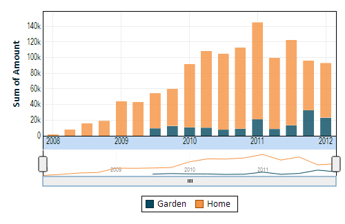
The timeline chart is very versatile. It can show data over time as line, bar, area, combination of bar and line, and more. In this example, we show quarterly payments over time broken by product category.
Hover the mouse over the bars or touch them on a tablet to see the details.
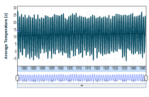
The weather station at Belvedere Tower in New York Central Park collected data since 1876. We show weekly average temperatures in Celsius for a period of 71 year. You can zoom in for details for specific date ranges, see the seasons and use the trend line to detect the long-term trend.
Data is courtesy of the U.S. National Climatic Data Center of the National Oceanic and Atmospheric Administration.