Introduction
Explore Analytics provides seamless integration with ServiceNow to deliver high-performance data exploration, analysis, and visualization without the need to build a data mart.
The challenge
To connect a BI tool with application data, there are typically three choices:
- Bypass the application, connect directly to its database and try to make sense of the data.
- Export data from the application into an external data store that’s more suited for BI tools.
- Access the data directly from the application using Web Services.
Each of these options suffers from serious drawbacks.
- The database of most application is utterly unsuitable for BI, requiring multiple joins to piece together application objects and too much knowledge of the inner working of the application. Even when feasible, bypassing the application typically means bypassing application-level security, a non-starter for most customers. And to put the last nail on the coffin, most SaaS applications including ServiceNow forbid such access altogether.
- Moving data from the application into a specialized store is expensive to setup because it requires specialized staff for data warehouse design and the implementation of ETL and data management tools. Even if resources are not a concern, you still end up with data that’s a snapshot in time and miss the up-to-the-minute data that user’s crave.
- Direct application access is the most promising option. It provides the user with application objects with recognizable names and all the security, localization, choice lists, and other tools that make data access easy. Nevertheless, the application must provide APIs that are designed for query and allow the BI tool to request data filtering and aggregation to be done by the application. This is required to prevent having to pull impractical amounts of data and performing the filtering and aggregation at the BI tools. Summarizing a million data rows by the application can take a few seconds; however pulling a million rows across the network could take minutes which it much too long for a user of an interactive tool.
Fortunately, ServiceNow provides such APIs that allow Explore Analytics to push 100% of the data filtering and aggregation to ServiceNow and never pull more than a few thousand data rows across the network.
The solution
Explore Analytics uses Web Services (SOAP) to access the ServiceNow instance and perform queries. It pushes 100% of the data filtering and aggregation to ServiceNow. For example, doing a monthly trend report of incidents only requires pulling a few rows for each month since the aggregation is done at the ServiceNow application using a GlideAggregate API.
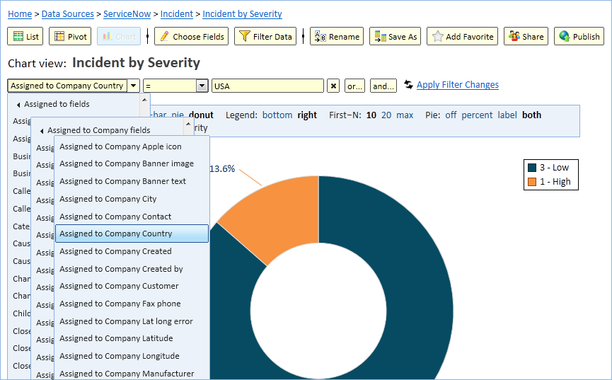
- Explore Analytics shows the friendly ServiceNow labels so that you see table and field names such as “Shopping Cart” and “Catalog Item” rather than “sc_cart” and “sc_cat_item” respectively.
- Explore Analytics fully supports choice lists so that you can construct a filter that looks like “Incident State = Resolved” rather than “Incident State = 6”.
- Explore Analytics understands reference fields and uses them to relate tables and combine multiple tables in a view.
- Explore Analytics understands ServiceNow display fields and uses them to allow you to naturally construct a filter such as “Caller Name = Beth Anglin” rather than “caller_id = 46d44a23a9fe19810012d100cca80666”.
- When creating a new view in Explore Analytics, it creates a list view that reflects the fields selected in the ServiceNow default view.
Conclusion
Setting up a ServiceNow data source in Explore Analytics takes minutes and allows you to begin exploring your data right away. No need to setup a data mart and no worry of runaway queries that pull your entire database.
By providing robust data query APIs, ServiceNow is leading the way for enterprise SaaS applications. For its part, Explore Analytics is designed to push as much of the filtering and aggregation to the source, eliminating the need to pull large data sets or store snapshot copies of the data.
