Trend analysis is one of the most useful tools for understanding the current state of things and their outlook. Is the business improving or deteriorating? Once visualized, trends are easy to spot. A single glance can tell us whether things are converging, diverging, or moving in a certain direction.
The Problem: Ready Historical Data is Out of Reach
For users, creating a trend chart is easy provided that historical data is readily available. Alas, this is often not the case. Let’s consider an example. An application keeps track of projects and all their tasks. Progress is recorded at the task level and information is rolled up to the project level. So far, this is all very typical. We can calculate the “% complete” of each project simply by adding up the hours completed and dividing by the total hours planned. Yet that only gives us the current status.
For trend analysis, we need to know the “% complete” for yesterday, and the day before, and last week going back in time. We may want to see this information broken down by task and grouped by team or subproject. To do so, the system must keep a history of the updates to each task and be able to tell us the number of hours completed on the task at any point in time.
Operational systems, as opposed to specially-designed data warehouses, typically fall short of this requirement in two ways:
- The system might simply update the hours on the task without keeping a history. In that case, our user is out of luck.
- The system may separately keep timecards. It may be possible to reconstruct the history from the timecards, but that would be outside the reach of our self-service user, if we assume they don’t have SQL and programming skills.
The Solution: Tracking Trend
“Tracking Trend” is a name for a simple feature that makes life easy for self-service users and allows them to trend data. It breaks the problem into three easy steps.
Step One
The first step is for the user to create a report showing current information. The report would show the “% complete” by project, subproject and team as of the time of running the report.
Step Two
The next step is to “Track Trend” on the report that was created in step one. To “Track Trend” means to create a job that runs the report on a schedule specified by the user, for example every day at 10pm, and capture the output into a table.
Step Three
The table created in step two is perfect for creating trend reports. The table has a date/time field indicating each time the report ran. A trend report can show trends at the project level and allow drill-down to the subproject and team level. Creating such a report is well within reach of a self-service user.
Other Example Applications for Tracking Trends
Tracking trend is useful for any calculated metric, such as inventory on hand, net worth, membership renewal rate, support backlog, top-10 list, and much more. Think for example how easy creating a burn-down chart becomes.
Track Trend in Explore Analytics
Explore Analytics makes tracking trend as easy as scheduling a recurring meeting in outlook. You specify the report (created in step one), the schedule, and a name for the table to hold the output. It’s that simple.
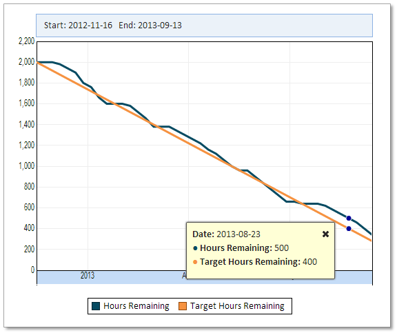
Burn-Down Chart