Show Me Nothing!

Show Me Nothing!

Some relationships can be tough.

Most of the time, when you’re running a report on relational data, you’re trying to see what relationships exist, and with Explore Analytics, that’s fairly easy to do.

What can be more difficult, however, is showing relationships that aren’t there. Because there is no relationship, there’s no data that exists.

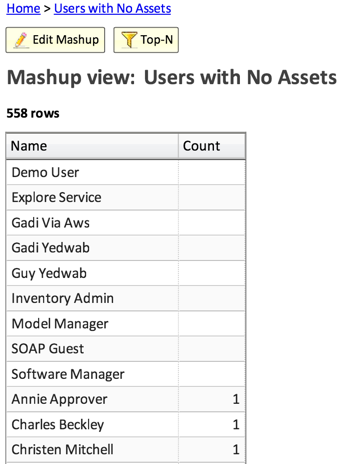
Let’s take a specific example: you want to create a view that shows users with no assigned assets.

Fear not! With Explore Analytics, we can create a report that can show you where there is nothing.

What we’re going to do is:

  1. Create a pivot of assets grouped by users – this provides the mapping of assets to users. This will be missing the users with no assets, however.
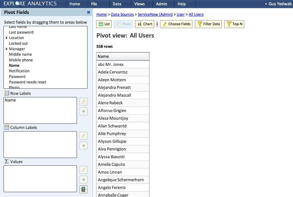
  2. Create a pivot of all the users – this provides us a list of all the users, including the ones with no assets – it’s going to fill in the gaps of the users with no assets.
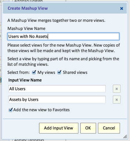
  3. Create a mashup of the two views – By putting the two views together, we are able to see any users without assets.

This method works the same whether it’s users with no assets, users who haven’t updated the system, assets without anti-virus, etc.

We’re going to walk through this example with the demo ServiceNow data source:

Create a pivot of assets grouped by users

  1. Create a new view on the Asset table
  2. Type: Pivot
  3. Row Labels: Assigned To
  4. Values: Count (should be auto-generated for you)
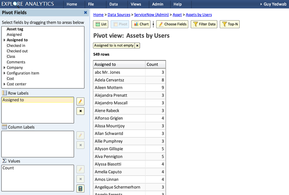
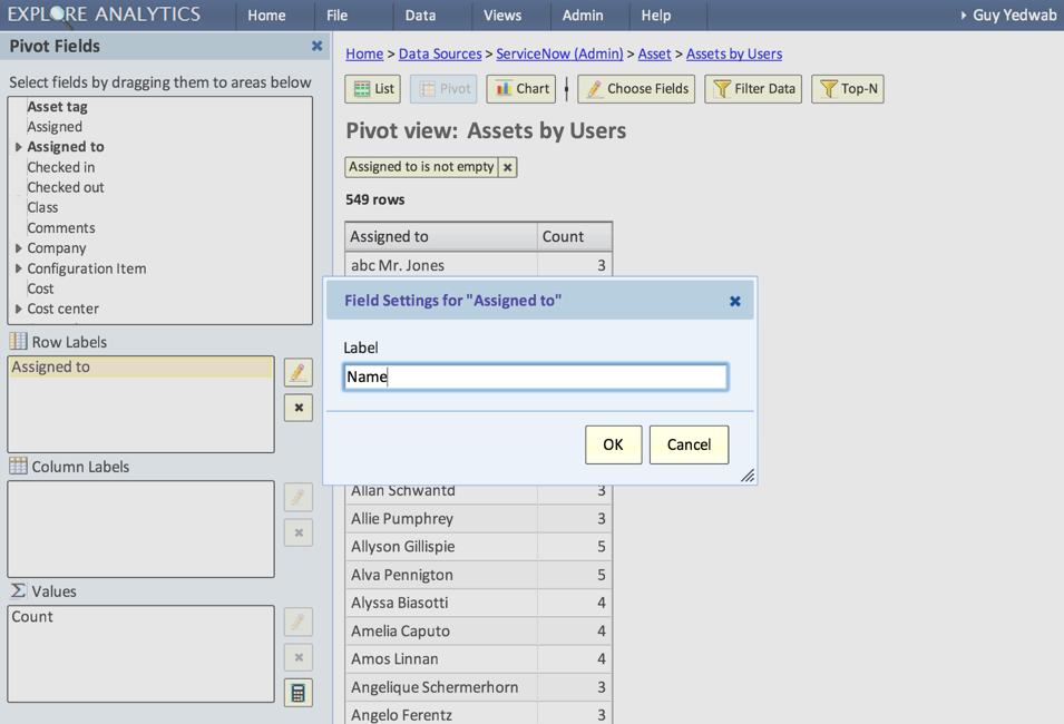
  1. Relabel the “Assigned To” field to “Name”. This will ensure that the “User” in this view matches the “User” in the other view.
Create a pivot of all users

  1. Create a new view on the User table
  2. Type: Pivot
  3. Row Labels: Name
  4. Remove “Count” from the Values field, we won’t need it
Create a mashup of both views

  1. Create a new mashup view, with both of the views we just created as an input view
  1. Sort by Count, smallest to largest.

  1. Voila! You should have a list, at the top of which are the users with no assets!
US Treasury Historical Yield Curve 1990 – 2013

The yield curve is a useful tool in forecasting near-term economic conditions. For example, the US Treasury yield curve is a chart with the yield (interest rate) on the Y axis and the term of the Treasury bond, from 30 days up to 30 years, on the X axis.

The yield curve on November 15, 2013, looked like this:

This curve increases from a very low rate for short-term bonds to significantly higher rates for longer-term maturities. This would be considered a normal or even steep curve that may signal quick economic improvement in the future.

The yield curve is not always shaped as it is today. It could become flat with short-term rates near long-term rates and even inverted, when some short term rates are higher than the longer-term rates. Such curves may signal uncertainty in the economy.

To see how the yield curve changed historically, consider the following chart. The chart is actually not showing the yield curve, but instead is showing a line for every bond duration, from 3-months to 30 years. It shows data for the last 23 years.

Here’s how to look at this chart:

  • The red line represents the yield on the 30-year bond. In a normal yield curve, this duration should have the highest rate and indeed you can see that most (but not all) of the time, it’s on top.
  • The unusual straight line in the 30-year bond from February 2002 to February 2006 is due to the fact that the US discontinued this bond and then reintroduced it.
  • It’s easy to see periods in which short-term and long-term rates bunch together and even invert, with lines representing short-term rates crossing over the lines representing long-term rates. It’s no surprise that they correspond, for example, with the stock market downturn in 2002 and the stock market crash in 2008-2009.

I invite you to explore this interactive chart by zooming in and scrolling through the timeline.

Data is from the U.S. Department of the Treasury.

About Explore Analytics

The charts in this article were created using Explore Analytics, a cloud-based self-service data analysis and visualization tool for individuals and teams.