Start Making Agile Decisions Today

What is Agile Decision-Making?

The Agile approach shifted project management towards a responsive and iterative strategy. Too often, however, the traditional decision-making processes are rooted in the old top-down approach: a quarterly PowerPoint presentation, analytics projects, long wait times to get answers to questions.

Agile decision-making is about applying the same responsive and iterative strategy to your decision-making and backing the decision making with agile reporting and analytics. Key decision-makers need the power to get real-time information quickly, ask follow-up questions, and dive deeper into the data.

Ask yourself: if a decision-maker is looking at my data and has a question: what happens next? Can they get the answer while looking at the data with a few clicks? Or do they need to file another “report request?”

If the answer is the latter, here are some powerful tools you can bring to the table to empower yourself and your decision-makers to make agile decisions:

Responsive Power through Interactive Controls

If you’re providing reports to decision-makers, you can maximize the value of each individual report simply by ensuring that a rich set of interactive controls are enabled and ready for use!

Even the most frequently used report can be enriched with some powerful controls – take a look at this report showing a timeline of Incidents Opened, Resolved, and Backlog.

Try interacting by:

  • Dragging and dropping across the timeline to filter on a set of time
  • Dragging and dropping the timeline bar at the bottom to change the set of time
  • Click on “Backlog” in the legend and select “Hide”
  • Click the “Chart Settings” at the top and:
    • Change the “Range”
    • Change the type of chart
    • Turn the “Values” on and off

Instead of building the same reports in ten different ways to appease ten different stakeholders, let them focus in on the span of time and presentation they need for the question they’re answering in the moment! 

Another example below shows how interactive dashboards can add even more interactive controls! Here are some things to try with the interactive dashboard:

  • Select “Green IT Initiative” from the “Portfolio” slicer to see how a decision-maker can quickly focus in on the data they want
  • In the list of project, click the project name “Cloud Health” to see how a decision-maker can quickly dive into another tab with more detailed information on how money has been spent in this project so far.

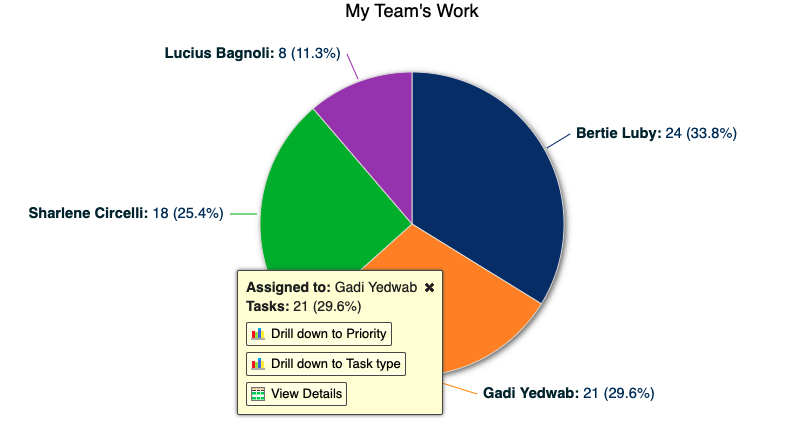
Users who are logged in can also drill-down to more specific reports or drill-through to the details:

Rapid Iterations with Self-Service Reporting

You may be used to building reports for stakeholders who only passively consume the reports. But an agile decision-making process ideally allows everyone in the process to rapidly iterate on the data.

Even if you create the initial starting point, allow stakeholders to easily iterate by providing easy and powerful self-service reporting – that way, they can have questions, try to answer them, and slowly develop more and more sophisticated reports.

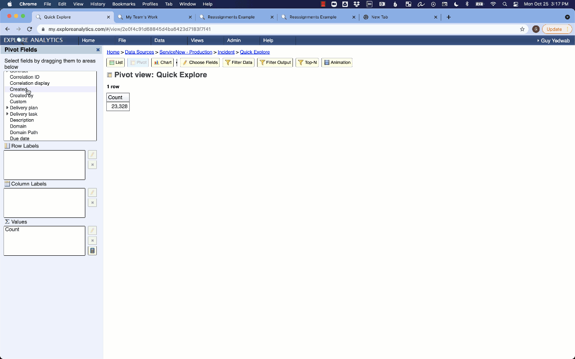
Watch the following to see how in a few clicks, we can go from the simplest report to a rich, multilayer pivot with interactive controls:

The Most Important Part of Agile: Just Get Started!

The key with agile is to get started and keep improving! Identify small, easy wins to start getting value in reporting. For example, is there a particularly important report that is currently generated as a flat PDF or complex-to-maintain Excel sheet? Take it on, replace it with an interactive dashboard, and you’re already getting value from the power of interactive, agile decision-making!

Aging Reports: Not Just For ServiceNow Incidents

The Power of Aging Reports

One of the most common reports we see operational teams depending on is an aging report. It’s no surprise: an aging report is a powerful way to focus the team on improving resolution times.

This classic example of an incident aging report shows the view of a manager whose team who needs to focus on their most stale incidents:

Users who are logged in can drill through to take action on these incidents, driving them to resolution. (Bonus technique: that report is contextually filtered so it shows each manager their own direct reports!)

But for this post, we’ll be examining some other contexts to apply aging reports.

First: the Ease of Aging Reports in Explore Analytics

If you’re thinking about making more aging reports, take a moment to think about how you build the reports.

Because ServiceNow doesn’t capture an “age” field, some organizations are using a code + customization based approach that has to be applied to each table. Others are dumping the data to Excel on a regular basis and building reports there.

Instead, Explore Analytics gives you the ability to build the report using a simple interface:

You just select “Treat Date as Age” on the “created” date-time, and fill in the groupings!

If you want to learn how to build an aging report for ServiceNow, check out this video!

Use Case 1: Other Task-Based Processes

This is the low-hanging fruit, but any task within ServiceNow (or outside of it!) is ripe for the same analysis.

HR Case Management, Customer Service Management, Facilities Management, or your own custom processes — anywhere you have a time-stamp representing when it was opened, you can apply this same approach.

Here’s an example of an HR Case aging breakdown:

(Bonus technique: use flexible, multi-level pivots to replace multiple reports — here, by allowing us to easily compare branches within the same report. Also: the “Branch” column is just a relabel within the report for Location.City — present fields in the way that is easiest for the viewer to understand!)

This highlights the importance of using a flexible tool like Explore Analytics to build the reports, rather than manual techniques like Excel or customizing ServiceNow for every table you want to build an aging report against. You want a tool in your toolkit that lets you apply these solutions over and over!

Use Case 2: Managing Contract Expirations or Other Due Dates

Instead of looking at the time since a task was created, you can also use the same approach to measure how long until a deadline. The methodology is the same, but gives you the ability to look at asset contract expirations, or other deadlines:

Use Case 3: Keeping CMDB and Knowledge Up to Date

Another variation is reporting on the age since a record was Updated instead of when it was created. That indicates whether your data is fresh, which is incredibly important for processes like asset management, CMDB, and knowledge management where data quality relies on being up-to-date.

Here is an example from our CMDB data quality pre-built application (video here!), showing which CIs are up-to-date by class:

Bonus technique: because Explore Analytics allows you to track long-term metrics in the same way as operational real-time report, here’s an aging KPI (among other CI metrics) to go along with that real-time dashboard:

Try it out today!

Excited to try out these use cases? If you don’t have a tool today to build these reports quickly, easily, and without writing code, try Explore Analytics free for thirty days here.