Cumulative Flow Diagrams: Agile Visibility on your Development Process

The Agile Development Process lets development teams move quickly. That speed provides a challenge for management: how do you keep on top of your team’s progress and quickly clear blocks?

Beyond stand-up meetings, slack messages, and constant emails, you can use Explore Analytics reporting to get a clear picture on where your team is at and where it is heading by building a Cumulative Flow Diagram.

What is a Cumulative Flow Diagram?

Cumulative Flow Diagrams (similar to “burn up charts”) are stacked area charts that show the amount of work in any state, such as work completed or in various stages of progress. At each point in time, you can see how many tasks were in each state. As more tasks get added, the area gets larger.

For example, in this chart you can see that our Alpha Release has a typical flow: from day to day, more tasks are being authored and pushed through the development process:

Authenticated users can drill through to the individual records themselves to take action and see specific updates. This powerful feature provides seamless transitions from looking at the overall picture to taking action.

What can you learn from it?

Cumulative Flow Diagrams are great for identifying blocks in the seamless flow of your development cycle.

Here, you can see our Beta release is running into a problem – the tasks marked “ready for testing” are growing faster than the other segments:

That indicates there’s a process block, where items are being developed faster than they can be tested.

Where’s the block in the process? Try clicking “Testing” in the legend and selecting “Keep Only Testing.” By focusing your view on just that one state, it’s easier to see that testing is not moving forward in a seamless way. Now, as a manager, you can focus on the block in the progress and see what you can do to get back on track.

For another example, you can see that our Gamma release has the problem that way too many tasks are being marked “Ready” at the start of our process, and we can’t keep up:

Again, now we know the bottleneck in the process, and we can shift staff or redefine scope to better meet our goals and expectations.

Get Started Today – Build your Cumulative Flow Diagram Now!

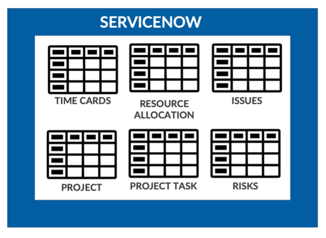
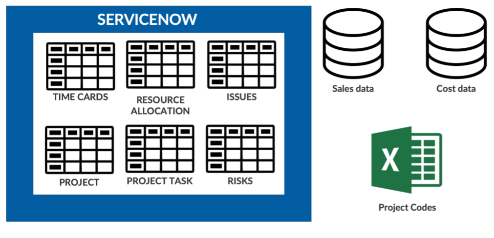
Under the hood, to get a Cumulative Flow Diagram is easy with Explore Analytics. All you need to do is create a real-time report of tasks by state, then schedule a “Track Trend” to capture and track the changes over time.

Want to see more detail? This video walks through building the report from end-to-end:

Within minutes you will be on your way to real-time visibility into how your development is progressing.

You Have the Data: What’s Stopping You?

Your organization has spent the time and energy to define processes, configure platforms, and you’ve finally got a wealth of ITSM data. Now it’s time to turn that data into insight. What’s in your way?

Sadly, this is all too common: limitations of technology and implementation turning a rich pool of data into something fragmented and unusable. Your data is collected by systems that are optimized for workflow transactions and are not organized for easy analytical processing.

Fortunately, there’s a solution! We’re going to walk through some common barriers that get between your data and insights, and how the powerful flexibility of Explore Analytics knocks those barriers down!

Islands of Data

Islands of data exist at two levels: within your applications and between your applications.

Within your applications, data can be scattered across multiple tables. In this example, reporting on ServiceNow projects, data is scattered across Projects, Project Tasks, Time Cards, Resource Allocations, Issues, Risks, and more:

In addition to the islands within ServiceNow, there’s more data that could enrich and deepen your insights that are outside of the application:

Today, attempting to bridge these islands may involve complicated database manipulation, scripted web service integrations, bulk scheduled migrating of data—and still not result in the reports you want!

Instead, Explore Analytics connects to the data where it currently resides – connecting directly to the tools that currently have the data and discovering all of the relevant tables and fields:

The agility of this quick set-up process is powerful – one organization connected to seven real-time sources of data within one month, containing hundreds of tables and fields. Once the data sources are connected, a few clicks allow you to mash-up the data across the tables in one report!

Here’s an example of a dashboard combining data from ServiceNow (across multiple tables), a call system, a chat system, and a call queueing system – all real-time, no code required:

Making the Data Shine

Connecting to the data is only half the battle. The other half of the battle is presenting the data in an easy to use, consumable format that easily attracts the viewer to the information you want to present. Sadly, too often you are restricted from being able to build those reports based on limitations of in-app reporting.

With Explore Analytics, you can mashup data from multiple tables and applications to seamlessly analyze it as easily as if it were all in one data set. Moreover, you have full flexibility to present the data in many ways to ensure that the viewer can see insights in the most powerful, flexible format.

For example, here’s a multi-level pivot with multiple dimensions of data, showing the year-over-year the number of incidents in each quarter, and % differences between those quarters. Some quick coloring rules and calculations highlight the data in a way that a simple bar chart showing the number of incidents wouldn’t be able to show:

This can also be done with calculations that turn the raw data into something easy for stakeholders to read. The following report buckets project tasks into “on time,” “minor delay,” and “major delay.” Under the cover, raw date-time stamps are converted into a duration, then bucketed based on those durations – all using easy codeless formulas. The result is a report that hides the complexity from the viewer unless they want to drill into the details:

Conclusion

As you’ve seen, even if you already have the data, you might be blocked from getting the full insights of the data because of the limitations of your toolset. You need a flexible reporting platform that allows you the ability to easily connect to the data, and easily transform the raw data into appealing outputs consumable by business users.

Try Explore Analytics today to experience the powerful flexibility, and within minutes you’ll be getting insight out of your islands of data!