Difference between revisions of "XY Chart"
Gadiyedwab (talk | contribs) (Created page with "==Overview== An XY chart visualizes relationships between numerical data and allows you to find correlations in the data. Data can be presented as a scatter plot or a bubble ...") |
Gadiyedwab (talk | contribs) |
||
| Line 5: | Line 5: | ||
==XY Scatter Plot== | ==XY Scatter Plot== | ||
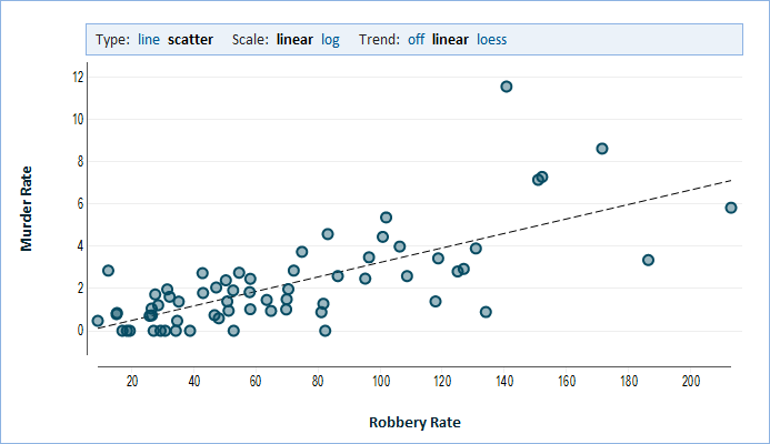
| − | A Scatter Plot is an XY chart in which we draw data points based on two numeric values. One value determines the horizontal (X) position, and the other value determines the vertical (Y) position. | + | A Scatter Plot is an XY chart in which we draw data points based on two numeric values. One value determines the horizontal (X) position, and the other value determines the vertical (Y) position. We study the relationship between these two values to see if one value could predict the other because they are correlated. |
[[File:xyscatter.png]] | [[File:xyscatter.png]] | ||
| + | |||
| + | A trend line can assist in seeing such a relationship. | ||
| + | |||
| + | *'''linear''' - a linear trend line is a straight line that passes as close as possible to all points (it minimizes the distance from all points). This is called a linear regression line. If the points appear to be close to the trend line, then the two values would appear to be correlated. | ||
| + | *'''LOESS''' - this line minimizes distance from points in its vicinity. The line is not straight but rather follows the points as close as possible. This is similar to a moving-average line in a stock chart, however an LOESS calculates a weighted average in which points that are closer to the line get a higher weight than outliers (points that are distant from the rest of the data). | ||
| + | |||
| + | ==Bubble Chart== | ||
| + | |||
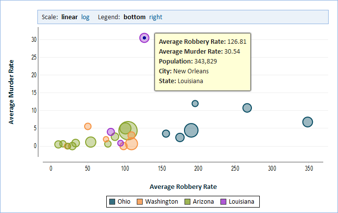
| + | In a bubble chart we show a third numerical value. We represent this third value by varying the size of each point which we now call a bubble. We make the area of the bubble proportional to the value and therefore larger bubbles represent a larger value for this third value. | ||
| + | |||
| + | [[File:bubblechart.png]] | ||
Revision as of 15:33, 5 July 2012
Overview
An XY chart visualizes relationships between numerical data and allows you to find correlations in the data. Data can be presented as a scatter plot or a bubble chart.
XY Scatter Plot
A Scatter Plot is an XY chart in which we draw data points based on two numeric values. One value determines the horizontal (X) position, and the other value determines the vertical (Y) position. We study the relationship between these two values to see if one value could predict the other because they are correlated.
A trend line can assist in seeing such a relationship.
- linear - a linear trend line is a straight line that passes as close as possible to all points (it minimizes the distance from all points). This is called a linear regression line. If the points appear to be close to the trend line, then the two values would appear to be correlated.
- LOESS - this line minimizes distance from points in its vicinity. The line is not straight but rather follows the points as close as possible. This is similar to a moving-average line in a stock chart, however an LOESS calculates a weighted average in which points that are closer to the line get a higher weight than outliers (points that are distant from the rest of the data).
Bubble Chart
In a bubble chart we show a third numerical value. We represent this third value by varying the size of each point which we now call a bubble. We make the area of the bubble proportional to the value and therefore larger bubbles represent a larger value for this third value.

