Difference between revisions of "Visualization"
Jump to navigation
Jump to search
Gadiyedwab (talk | contribs) |
Gadiyedwab (talk | contribs) |
||
| Line 5: | Line 5: | ||
Explore Analytics provides a rich set of visualizations that include line graphs, bar charts, area, pie, donut, scatter, and bubble, to name the most popular types. However, as you see below, it guides your visualization based on the data that you want to visualize: | Explore Analytics provides a rich set of visualizations that include line graphs, bar charts, area, pie, donut, scatter, and bubble, to name the most popular types. However, as you see below, it guides your visualization based on the data that you want to visualize: | ||
| − | *'''Timeline Chart''' - choose a timeline when you want to visualize temporal data to show trend and change over time. Data in the timeline can be presented using lines, bars, area, HLOC, and candlestick and you can easily switch between these presentations while keeping the overall structure of a timeline | + | *'''[[Timeline Chart]]''' - choose a timeline when you want to visualize temporal data to show trend and change over time. Data in the timeline can be presented using lines, bars, area, HLOC, and candlestick and you can easily switch between these presentations while keeping the overall structure of a timeline. |
: [[File:timeline.png]] | : [[File:timeline.png]] | ||
| − | *'''Category Chart''' - choose a category chart when you want to visualize data in categories for comparison. Data in a category chart can be presented using horizontal and vertical bars, pie, and donut | + | *'''[[Category Chart]]''' - choose a category chart when you want to visualize data in categories for comparison. Data in a category chart can be presented using horizontal and vertical bars, pie, and donut. |
: [[File:category.png]] | : [[File:category.png]] | ||
| − | *'''XY Chart''' - choose an XY chart when you want to visualize numerical data and find correlations. Data is presented as a scatter plot or bubble chart | + | *'''[[XY Chart]]''' - choose an XY chart when you want to visualize numerical data and find correlations. Data is presented as a scatter plot or bubble chart. |
: [[File:xy.png]] | : [[File:xy.png]] | ||
| − | *'''Map Chart''' - choose a Map chart to visualize spatial relationships in data by indicating data on a geographical map | + | *'''[[Map Chart]]''' - choose a Map chart to visualize spatial relationships in data by indicating data on a geographical map. |
: [[File:choropleth.png]] | : [[File:choropleth.png]] | ||
Revision as of 10:30, 12 September 2012
Overview
A chart is a view that presents data visually.
Explore Analytics provides a rich set of visualizations that include line graphs, bar charts, area, pie, donut, scatter, and bubble, to name the most popular types. However, as you see below, it guides your visualization based on the data that you want to visualize:
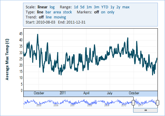
- Timeline Chart - choose a timeline when you want to visualize temporal data to show trend and change over time. Data in the timeline can be presented using lines, bars, area, HLOC, and candlestick and you can easily switch between these presentations while keeping the overall structure of a timeline.
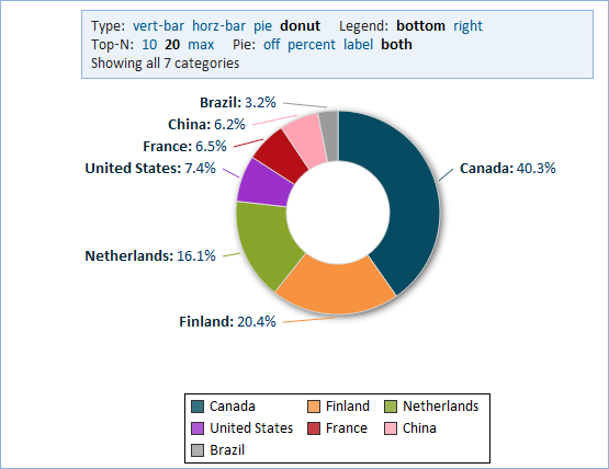
- Category Chart - choose a category chart when you want to visualize data in categories for comparison. Data in a category chart can be presented using horizontal and vertical bars, pie, and donut.
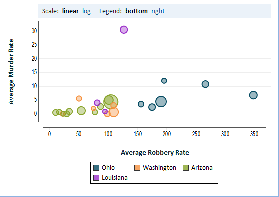
- XY Chart - choose an XY chart when you want to visualize numerical data and find correlations. Data is presented as a scatter plot or bubble chart.
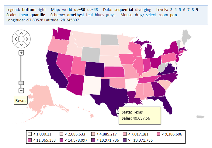
- Map Chart - choose a Map chart to visualize spatial relationships in data by indicating data on a geographical map.


