Scorecard View from a Pivot
Introduction
A pivot view is a great tool for calculating the main indicator for a scorecard.
An Example
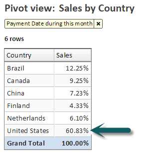
In this example, we'll start with a pivot that calculates US Sales as the percent of total for this month.
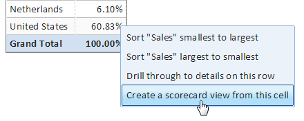
To create a scorecard, we simply click on the value (60.83%) and select "Create a scorecard view from this cell".
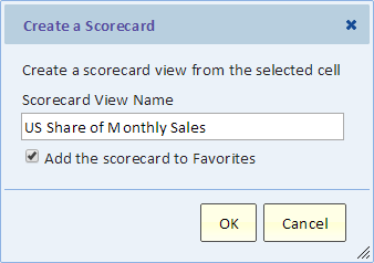
The scorecard view name will also be its title.
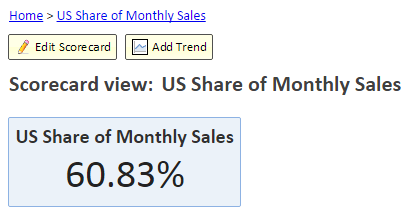
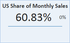
The result is this scorecard
The scorecard is showing the current value for last month.
Adding Trend to the Scorecard
Continuing with our example, we can instantly add trend information to the timeline using the "Add Trend" button. You can see the "Add Trend" button in the previous image.
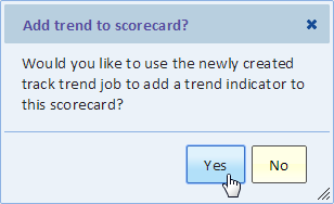
Using the Track Trend dialog, we can select a monthly frequency for the trend. Next, we're prompted to add the trend to the scorecard. Click "Yes".
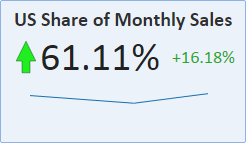
The result is shown next.
And after a few months of data accumulation, it might look like this
