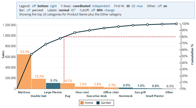
Pareto Chart
Contents
Overview
A Pareto chart is used to highlight the most important among a set of factors. In quality control, it often represents the most common sources of defects or the most frequent reasons for customer complaints.
A Pareto chart users bars to show a value by category in decreasing order. The value may be a count (frequency), for example the number of complaints, but it can also be any value. For example, if analyzing revenue by product, a Pareto can show the products that contribute the most to revenue. In that example, the value may be total sales by product.
A Pareto chart has a line component that shows the cumulative percent. For example, we can use this line to find the products that together contribute 80% of the revenue. Going left to right, each category is added to the cumulative percent until we reach the desired cutoff.
Defining a Pareto Chart
To define a Pareto chart, you need to select two or three fields (the Color Category field is optional).
Category Field
This field defines the categories of our Pareto Chart. For the examples in the Overview section above, these can be categories of defects, reasons for customer complaints, or product names.
Value Field
This field defines the value being measures. For the examples in the Overview section above, these can be the number of defects, the number of customer complaints, or the total product sales.
Color Category Field
This setting is optional. It allows us to color code the categories according to some grouping of these categories. In the picture above, we're coloring the "Garden" products in one color and the "Home" products in another.
When using a Color Category field, you must use caution. The Color Category must be unique for each category. For example, in our picture, a product can be in the "Garden" or "Home" category, but not in both. If it is in both, it will create a duplicate in the chart and lead to an invalid Pareto chart.
