Pareto Chart
Contents
Overview
A Pareto chart is used for highlighting the most important among a set of factors. In quality control, it often represents the most common sources of defects or the most frequent reasons for customer complaints.
A Pareto chart uses bars to show a value by category in decreasing order. The value may be a count (frequency), for example the number of complaints, but it may also be any value. For example, if analyzing revenue by product, a Pareto can show the products that contribute the most to revenue. In that example, the value may be product sales.
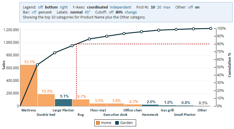
A Pareto chart has a line that shows the cumulative percent. For example, we can use this line to find the products that together contribute 80% of the revenue. Going left to right, each category is added to the cumulative percent until we reach the desired cutoff.
A Pareto chart has a Y axis on the left showing the value, and a Y axis on the right showing the cumulative percent.
Defining a Pareto Chart
To define a Pareto chart, you need to select two or three fields (the Color Category field is optional).
Category Field
This field defines the categories of our Pareto Chart. For the examples in the Overview section above, these can be categories of defects, reasons for customer complaints, or product names.
Value Field
This field defines the value being measured. For the examples in the Overview section above, these can be the number of defects, the number of customer complaints, or product sales.
Color Category Field
This setting is optional. It allows color coding the categories according to some grouping of these categories. In the picture above, we're coloring "Home" products in one color and "Garden" products in another.
The color category field can also act as a secondary category. For example, suppose the main category is the product and the color category is the region. The result will be a bar for every product in every region that has this product. The label under the bar indicates the product and the color indicates the region.
Viewing a Pareto Chart
The person viewing a Pareto chart can control certain aspects of the presentation using the following options in the chart header.
Legend
The legend is only applicable when using a Color Category field. The legend can be placed at the bottom of the chart, on the right side, or not displayed at all (off).
Y-Axes
The Pareto has two Y-Axes. When "Coordinated" is chosen, the height of the bar matches both axes. The axis on the left shows the value and the one on the right shows the percent of total. When "independent" is chosen, the height of the bar only matches the axis on the left. This allows us to make better use of the space and draw the bars higher.
The line in the Pareto is not effected by this option.
First-N
You can choose limit the view to the first (largest) 10 categories, 20 categories, or the maximum number of categories that would fit in the allotted space, possibly all the categories. When showing less than all the categories, you can control whether to show the "Other" category.
Other
When showing the "first n" categories, but not all the categories, the "Other" category shows the sum of the remaining categories. It is recommended that you show the "Other" category as it explains how we get to 100%, but you may choose to hide the "Other" category.
Note: if you already have a category named "Other" in your data set, then the "Other" category added by Explore Analytics is called "*Other".
Bar
You can display the percent for each bar as a label above the bar ("on") or you can choose not to show it ("off"). If you don't show it, the viewer can still read the value by using the right Y axis or using the tooltip by hovering over the bar with the mouse or touching the bar on a touch device.
Labels
The category labels are automatically arranged so that they don't run over one another. The labels will display horizontally if they can fit in one or two lines, or be rotated 45 degrees if they still would not fit horizontally. The viewer may force the labels to display at 45 degrees using the Labels option.
Cutoff
This is an important feature. It helps the user separate the "important" categories that make up the majority of the cumulative value from the "less important" categories. For example, in the picture above, "cutoff" is set to 80% and it's easy to see that the first three products add up to close to 80% of the total sales and with a little help from the fourth product they exceed 80%. The user can change the value of the cutoff to any percentage value (e.g., 95%) to see how many products make up that amount.
Setting "Cutoff" to "off" removed the cutoff line from the chart.
