Difference between revisions of "Editing Chart Colors"
Gadiyedwab (talk | contribs) (Created page with "==Introduction== In most cases, no need to change the colors that are automatically. These standard colors, drawn from the default color palette of Explore Analytics are desi...") |
Gadiyedwab (talk | contribs) |
||
| Line 27: | Line 27: | ||
[[File:color_picker.png]] | [[File:color_picker.png]] | ||
| − | The area on the lower left shows the custom color next to the existing color from which you started. The display in the lower center shows the hex representation of the color. You can use this to enter a hex directly, or you can click or drag the controls to select a color. When you’ve made your selection, click OK. | + | The area on the lower left shows the custom color next to the existing color from which you started. The display in the lower center shows the [http://en.wikipedia.org/wiki/Web_colors#Hex_triplet hex representation of the color]. You can use this to enter a hex directly, or you can click or drag the controls to select a color. When you’ve made your selection, click OK. |
To dismiss the color picker without making a change, click anywhere outside the picker. | To dismiss the color picker without making a change, click anywhere outside the picker. | ||
Revision as of 22:44, 13 December 2013
Contents
Introduction
In most cases, no need to change the colors that are automatically. These standard colors, drawn from the default color palette of Explore Analytics are designed to work well together and provide consist quality.
There are cases however, in which you may want to assign your own colors to certain categories. This is when your audience would immediately recognize the categories based on their color. For example in mapping US election results, people immediately recognize red and blue to indicate the Republican and Democratic parties respectively.
Editing Chart Colors
To edit chart colors, in other words to assign colors to data categories in the chart, you’ll need to have the chart showing and then select the “Edit this chart’s colors” from the “File” menu.
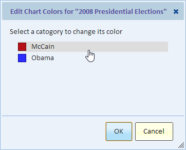
In the dialog, you see a list of the chart categories and their current color assignment. You can change colors one at a time. Click on the category to bring up the color selection dialog.
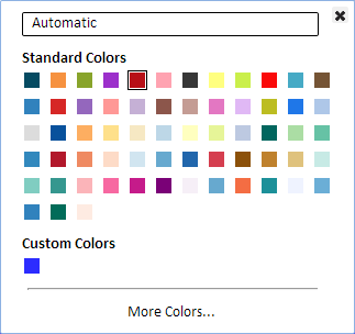
The current selection is indicated by a border around the color. In the picture above, the fifth color from the left on the top row is the one that’s currently selected.
To select a color, simply click on the color. The color is assigned to the current category and the color selection dialog is dismissed.
To dismiss the dialog without making any change, use the “x” button at the top right corner of the dialog, or simply click (or touch) anywhere outside the dialog.
More Colors...
In most cases, you should pick from the standard colors. However, if you need a different color, you can click “More Colors…” and create a new custom color using the color picker.
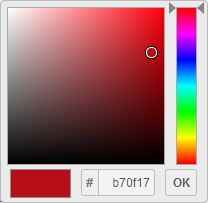
The area on the lower left shows the custom color next to the existing color from which you started. The display in the lower center shows the hex representation of the color. You can use this to enter a hex directly, or you can click or drag the controls to select a color. When you’ve made your selection, click OK.
To dismiss the color picker without making a change, click anywhere outside the picker.
Automatic
By default, colors are assigned automatically. To remove a color assignment, click “Automatic”. The category will be assigned the next available color.
Understanding Color Assignments
For each categories that’s set to “automatic” (the default), the next available color in the standard colors is assigned. By “next available” we mean the next color that’s not already assigned to a category.
When you assign a color to a category, you may notice a change to the color of all the automatic categories as they are re-assigned the next available color. If you want to be absolutely certain that no colors in your chart would change, then you’ll need to explicitly define a colors for all categories.
Unused Categories
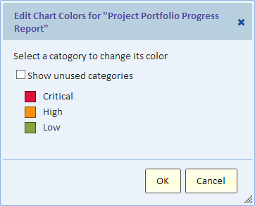
The “Edit Chart Colors” dialog shows the categories from the currently displaying chart. The categories are based on your data and the current filter. For example, a chart showing data for the current week may only have three priorities.
Another time, this same chart may have more than three different priorities. Therefore, to assign colors for all priorities, run the chart with no filter to capture all the priorities and assign colors to them. Later if you want to make changes and the chart is showing some but not all the priorities, you can select “Show unused categories” to show all the categories, including the ones that are not part of the current data. They’re called unused because there’s not used in the currently displaying chart, but they do have a color assignment that’s stored with the current chart and will come into play if the data changes.
ServiceNow
If your view is using a ServiceNow data source, then it gets some color assignments for things in ServiceNow such as priorities, severities, and risk. If you need to edit colors, you can edit colors as described in this page. You changes would apply to the current chart.
To see the color assignments that your view inherited from the ServiceNow data source, select “Show unused categories” to reveal all those categories that have a color assignment. Many of those categories may not be relevant to your chart, but there’s no harm in that. If you want to remove unused color assignments, then change each unused category to “Automatic”.


