Chart Animation
Revision as of 18:19, 4 February 2016 by Gadiyedwab (talk | contribs)
Introduction
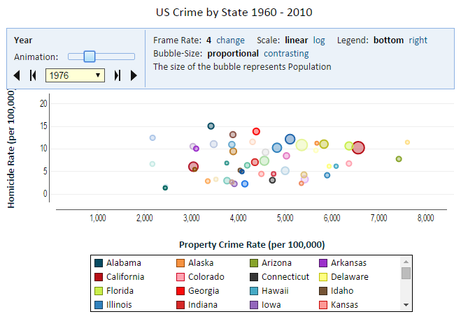
You can add another dimension to your chart and animate your chart by using the Animation feature. You can use the animation field to add another category field to your chart and allow your user to select a top-level category even if animation is not applicable. Animation is mostly applicable when the animation field is a date-time field.
Adding Animation
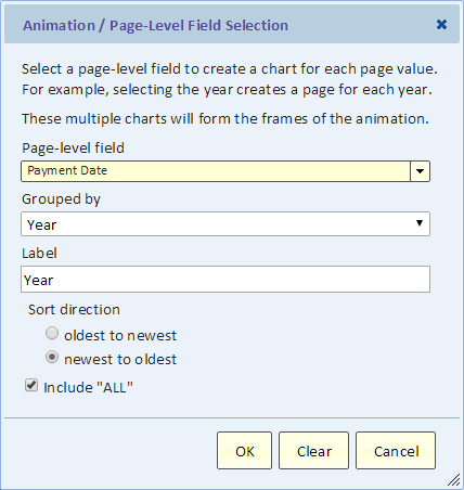
Use the animation button to bring up the animation dialog.
Select a field for the animation. If it's a date-time field you can select the grouping (e.g., year). If it's a numeric, duration or date-time field, you can specify binning to turn it into a number of categories (bins).
Include "ALL"
You can create a summary page to be the first page. That page summarizes all the pages that follow.

