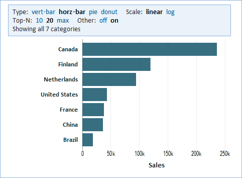
Category Chart
Overview
A category chart visualizes data by category for easy comparison. A category chart can visualize using a bar, pie, or donut chart.
Type
'Bar Chart' allows easy comparison of values for categories. You can show more than one value for each category. Such values will be color-coded and a legend will be displayed. If applicable, you'll have the option to stack that bars for multiple values for each category, or show them side-by-side.
- vert-bar - a vertical bar chart can show more bars
- horz-bar - a horizontal bar chart allows more space for labels for each bar
'Pie and Donut Charts' visualize values for categories as portions of the whole.
- pie - a pie chart
- donut - a donut chart
Top N
Rather than show all categories, you may restrict the chart to only showing the first "N" categories. "N" can be 10 or 20, or max to show as many as can fit in the space of the chart. When showing fewer than all categories, you have an option of showing an "Other" category that aggregates the remainder categories. Note that when your chart is showing average values, it is not possible to aggregate such averages into the "Other" category.
