Calendar Chart
Introduction
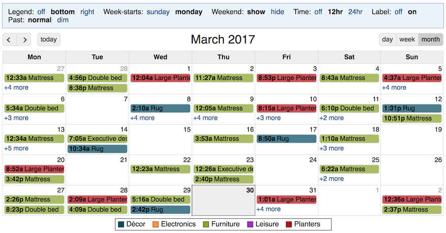
A calendar chart shows data records, typically events, displayed on a monthly, weekly, or daily calendar. Events can be at a point in time, or have a start and end time.
You can use a Calendar chart to quickly review multiple events, see overlapping events, color events by category, and get more information about each event.
Creating a Calendar Chart
To create a Calendar chart, use the New view option on the File menu and select a chart of type calendar. Next, define the chart by selecting fields.
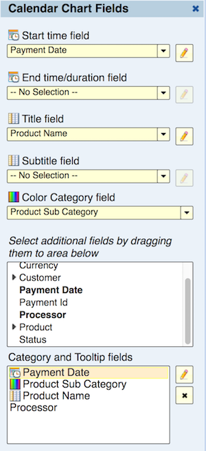
Start time field
Select a date-time field that has the time of the event, or if the event has a start and an end, the start time of the event.
End time/duration Field
This selection is optional. Leave it with “no selection” if the event does not have a start and an end (a point-in-time event). Otherwise, you can select either a duration field representing the duration of the event (for example 1 hour), or a date-time field representing the end time of the event. If the value of this field for any event is empty, the event is displayed like a point-in-time event that does not have a duration. In the weekly or daily calendar, a point-in-time duration is shown with a constant height equivalent to an event with a 30-minute duration.
Title Field
This is the first of two fields that you can display as the label of the event in the calendar. This field is optional and if you don’t want to show a label for the event, you can leave it with “no selection”.
Subtitle Field
This is the second of two fields that you can display as the label of the event in the calendar. This field is optional and if you don’t want to show a second field in the label, you can leave it with “no selection”.
Color Category Field
Events can optionally be colored by category. Those categories are shown in the legend. The legend allows the user to select categories to hide/keep. Moreover, if a drill-down path (or hierarchy) is defined for this field, the user can drill-down along the drill path.
Category and Tooltip fields
The values of the start, end, title, subtitle, and color fields are shown in the tooltip when you hover over the event or click on the event. This list of Category and Tooltip fields allows you to order the fields in the tooltip and add additional fields to be displayed in the tooltip.
Time Zone
By default, the dates shown in the calendar are in the time zone of the data source. These are the dates returned by the data source. An option to show dates in the user’s local time zone is available when the data source time zone is defined as explained below. In this case, the dates in the calendar can be shown in the user’s local time for each user.
Defining the Data Source Time Zone
Dates are retrieved as text without a time-zone designation. You can specify the data source time zone in the Edit Data Source dialog. This enables the conversion of dates to another time zone.
User’s Local Time Zone
When conversion to local time zone is available, the user’s local time is defined by the user’s device such as PC or mobile device. For example, if the user is in San Diego and their PC is set to Pacific Standard Time (PST), that’s the user’s local time and dates in local time will be in PST. Daylight savings time is taken into account based on the user’s device.
Time Zone and Mashup Calendars
You can create a mashup to combine data from multiple calendar views. In this case, dates are shown based on each data source of each input view. If the time zone is defined the same across all input view’s data source, then conversion to local time is possible.
Calendar Chart Display Controls and Options
Header Options
Legend
If you specify a Color Category field, a legend is shown. This option allows you to display the legend on the right of the calendar, at the bottom, or hide it.
Week Starts
This option allows you to display the calendar with the first day of the week being Sunday or Monday.
Weekend
By default, the calendar displays all seven days of the week. This option allows you to hide the weekend (Saturday and Sunday) and only show work days.
Time
By default, each event is labeled by the time-of-day of the start of the event. This label shows time down to minutes. This option allows you to show the time using a 12-hour clock (e.g., 8:15p) or using a 24-hour clock (e.g., 20:15). This option also allows you to turn the time off the label.
Label
Up to two fields, title and subtitle, can form the label of the event. This option allows choosing between showing the title, subtitle, both or none.
Past
This option allows you to dim (tint) events that are in the past. You can turn this option on or off.
Time-Zone
As explained in the section Time Zone this option is only available if the time zone is defined in the data source. Explore Analytics needs to know the time zone of the data source in order to offer to convert dates to the user’s local time zone.
By default, dates are displayed in the time zone of the data source. If you select local time, then dates are converted to the user’s local time. If you publish the calendar to multiple users, each user will see the date in their time zone as defined by their device (personal computer, laptop, or smartphone).
Header Buttons
Below the header you can find the following navigation buttons.
previous
Go to the previous month, week, or day.
next
Go to the next month, week, or day.
today
This button takes you to the current date, even if there’s no data for the current date.
day
Display a daily calendar.
week
Display a weekly calendar.
month
Display a monthly calendar.


