Difference between revisions of "Map Chart"
Gadiyedwab (talk | contribs) |
Gadiyedwab (talk | contribs) |
||
| Line 113: | Line 113: | ||
To make the selection point the mouse at the beginning of the selection and then click the mouse and drag it diagonally while pressing the mouse button down to select a rectangle. When you release the mouse button the selection is complete. On a touch device, you begin the selection by touching with your finger and then drag your finger diagonally to draw a rectangle. When you lift your finger off the screen, the selection is made. You can zoom in repeatedly to focus on smaller areas of the map. Finally to zoom out click the Reset button. | To make the selection point the mouse at the beginning of the selection and then click the mouse and drag it diagonally while pressing the mouse button down to select a rectangle. When you release the mouse button the selection is complete. On a touch device, you begin the selection by touching with your finger and then drag your finger diagonally to draw a rectangle. When you lift your finger off the screen, the selection is made. You can zoom in repeatedly to focus on smaller areas of the map. Finally to zoom out click the Reset button. | ||
| − | {{Template:TOC|XY Chart| | + | {{Template:TOC|XY Chart|Custom Map}} |
Latest revision as of 18:36, 16 June 2017
Contents
Overview
A Map chart allows us to visualize spatial relationships in data by indicating data on a geographical map. Explore Analytics provides two main types of map charts:
- Geographical Points - show data points on a map by indicating markers at geographical coordinates similar to the way that an XY chart places points at XY coordinates. The marker can vary its shape, color and size (the latter is called a “Bubble” chart). The marker can itself be a pie chart as we’ll see later.
- Geographical Areas - color areas on a map to indicate a value or a category of data for an area. For example, areas could be states of the United States and their color can indicate a numerical value for each state. This type of a map chart in which we color geographical areas is known as a choropleth.
Geographical Points
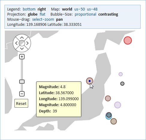
The example below shows earthquakes around Japan indicated on a map. The size of the point indicates the magnitude of the earthquake and the location of the point indicates the latitude and longitude of the location of the epicenter of the earthquake.
Bubble-Size
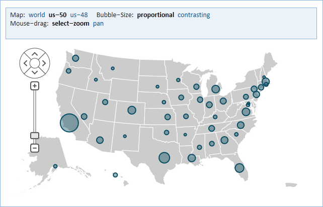
As in XY Charts, the area of the bubble can be proportional to the value (in our example above it’s the magnitude of the earthquake). This is the "proportional" option.
For better contrast, we can use the smallest bubble for the smallest value in the data and grow the radius of the bubble with the value. This is the "contrasting" option.
The value is an aggregate value such count, average, or sum. If the value represents a single value (e.g., single earthquake magnitude), you can select "average".
Pie
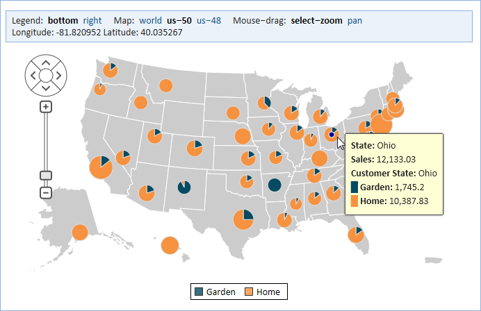
A notable feature of the Explore Analytics Map Chart is the ability to show a pie chart for each location. For example, if we are showing sales by state, we could further breakdown sales for each state by product category and show that as a pie. The size of the pie as a whole corresponds to the sales for each state and then the pie shows the portion attributed to each category.
Location By
A location on the map can be specified by latitude and longitude. This is the most specific option for specifying a location. You'll need to select two fields, a latitude field and a longitude field that hold the value of those coordinates in degrees. Other options such as Country or US County specify a location (point) that falls in the center of that area.
Geographical Area - Choropleth
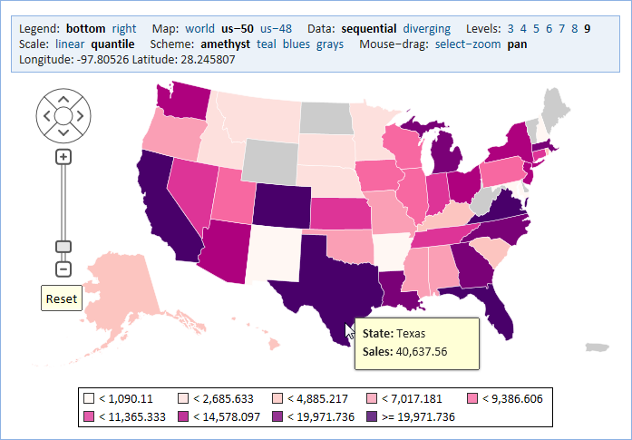
The example below shows sales by state by coloring each state. The states that are shown in gray are states for which there’s no data. In our example, states with larger sales are shown using a darker shade and states with lower sales have a lighter shade.
Location By
A location in a choropleth is defined by its perimeter -- a polygon that has the shape of the borders of the area (e.g., Country or US State).
Custom Location
The Custom Map page describes how to define a custom set of locations (e.g. census areas or congressional districts) by uploading a custom location map.
Data
The data shown in a Geographical Area map chart can be categories or numerical values. The sales amounts in the previous example are numerical values, of course. For an example of categories we could show the result of an election with a color for every political party such as Democrats and Republicans.
When showing categories, the colors are assigned from a palette of distinctive colors similar to the colors used in a pie chart. When showing numerical values, we use color schemes that reflect the numerical value using color shades.
Explore Analytics has two groups of color schemes. The first, sequential, is designed for data that has values that progress from low to high. The second, diverging, puts equal emphasis on mid-range critical values and extremes at both ends of the data range Levels. An example of diverging can be acidity where PH of 7 is neutral and higher and lower PH values diverge to acidity and alkalinity.
Levels
The range of numerical values is divided into a number of levels that are then mapped to colors. You can set the number of levels to between 3 and 9 to control the granularity of this mapping. Scale
Explore Analytics offers two options for mapping numerical values to colors. In a linear scale, the range of data values is equally divided to the specified number of levels. In a quantile scale, the range of data values is divided based on data frequencies. This is best explained using an example. If we wanted to show the bottom quartile of states that has the lowest sales using the first color, the next quartile using the second, and so on, we choose 4 levels and a quantile scale.
Color Schemes
Based on the choice of sequential or diverging data we have a choice of several appropriate color schemes. These schemes are based on schemes designed by Cynthia Brewer and Mark Harrower at The Pennsylvania State University.
Map Projections
The challenge of projecting a spherical earth onto a flat map has occupied cartographers for centuries. The result is a choice of various map projections that have their advantages and disadvantages. Moreover, a map projection can show the entire earth or focus on a geographical area such as a single country.
Flat
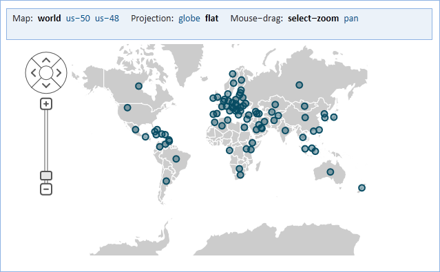
A flat projection (Explore Analytics uses the Mercator projection for a flat projection) is useful for showing longitude lines as straight vertical lines. This is the type of map that easy to tile and it’s the one used in most internet mapping tools.
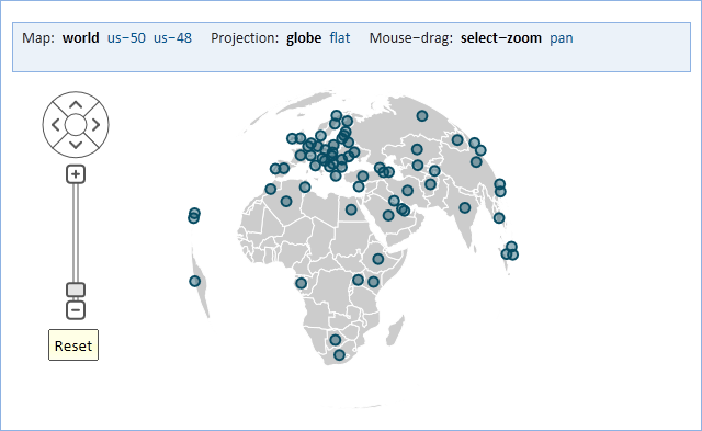
Globe
A flat map exaggerates sizes that are farther from the equator. As an alternative, Explore Analytics has the globe projection (Explore Analytics uses the Azimuthal projection). This projection shows the geography as if you were looking at a point on a globe from space.
US-48 and US-50
Explore Analytics also has two specialized projections for the United States--the US-48 and US-50. These projections are based on the Albers projection and are particularly useful for a choropleth because they preserve the relative area of geographical areas.
Custom
The Custom Map page describes how to upload and use a custom map.
Zoom, Pan, and Focus
Panning is moving the point of view. For example, panning to the right means that we bring areas that are to the east to the center of the view. Similarly, panning left brings areas to the west towards the center of the view. Panning up shows more of the north and panning down shows more of the south.
By combining panning and zooming we can focus on areas of interest. Explore Analytics automatically focus on data if it is all in one area of the map.
There are multiple ways to pan and to zoom. You can pan using the panning control:
You can also pan by dragging the map with the mouse or, on a touch device, using your finger.
To zoom in/out you can use the zoom controls:
You can also zoom using the mouse wheel by placing the mouse pointer over the map and then using the mouse wheel to zoom in or out. The best way to zoom is by selecting an area on the map to zoom on. The selection can be done using the mouse or, on a touch device, using your finger.
Mouse-drag
Because you can use the mouse (or touch) to either pan to view or make a selection to zoom on, Explore Analytics allows you to specify which action you’d like to perform using the mouse. The default is to select-zoom. In this mode you can select a rectangle on the map.
To make the selection point the mouse at the beginning of the selection and then click the mouse and drag it diagonally while pressing the mouse button down to select a rectangle. When you release the mouse button the selection is complete. On a touch device, you begin the selection by touching with your finger and then drag your finger diagonally to draw a rectangle. When you lift your finger off the screen, the selection is made. You can zoom in repeatedly to focus on smaller areas of the map. Finally to zoom out click the Reset button.
