Creating a Timeline Chart
Revision as of 19:26, 16 December 2014 by Guy.yedwab (talk | contribs) (→Creating a Timeline Chart)
Overview
A timeline chart visualizes data trends and changes over time.

Timelines groups data based on a field representing date or time. This can include:
- Date field (e.g. 2014-01-01)
- Date-time field (e.g. 2014-01-01 00:00:00)
- An integer field representing a year (e.g. 2014)
Creating a Timeline Chart
To create a new timeline chart:
- Navigate to File > New View.
- Select the appropriate data source and table. Make sure the table has at least one date, date-time, or integer field.
- Give the view a name and select Chart - data visualization view.
- Select Timeline.


The new timeline chart will default to grouping the data with the first date, date-time, or integer field available in the data.
Select the following to define the timeline chart:
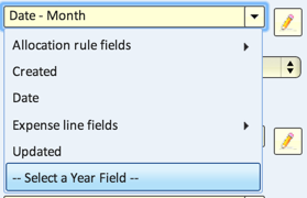
- Date/Time field - defines the x-axis of the timeline.
- Note: to use an integer field as a Year grouping, click 'Select a Year Field' at the bottom of the drop-down enable picking integers as options.
- Grouped by - groups the values along the x-axis. Options are:
- Year
- Quarter
- Month
- Week (Sunday)
- Week (Monday)
- Day
- Hour
- Quarter Hour
- Exact Time
- Group into Bins
- Secondary Category field - (optional) groups the values further.
- Value fields - populates the values in the timeline. Select value fields by dragging them from the Available Fields into the Value Fields section.
