Creating a Timeline Chart
Overview
A timeline chart visualizes data trends and changes over time.

Timelines groups data based on a field representing date or time. This can include:
- Date field (e.g. 2014-01-01)
- Date-time field (e.g. 2014-01-01 00:00:00)
- Year field (e.g. 2013, 2014)
Creating a Timeline Chart
To create a new timeline chart:
- Navigate to File > New View.
- Select the appropriate data source and table. Make sure the table has at least one date, date-time, or integer field.
- Give the view a name and select Chart - data visualization view.
- Select Timeline.


The new timeline chart will default to grouping the data with the first date, date-time, or integer field available in the data.
Select the following to define the timeline chart:
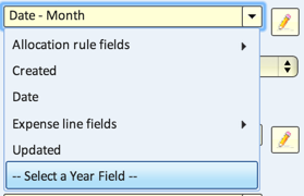
- Date/Time field - defines the x-axis of the timeline.
- Note: to use an integer field as a Year grouping, click 'Select a Year Field' at the bottom of the drop-down enable picking integers as options.
- Grouped by - groups the values along the x-axis. Options are:
- Year
- Quarter
- Month
- Week (Sunday)
- Week (Monday)
- Day
- Hour
- Quarter Hour
- Exact Time
- Group into Bins
- Secondary Category field - (optional) groups the values further.
- Value fields - populates the values in the timeline.

Header Controls
Type
Once you create a timeline chart, you can select one of the following types to best visualize your data:
- line - show data values over time as continuous lines. This is useful for showing continous values such as temperature and to show trend
- bar - show data values in points in time or time intervals. This is useful for showing monthly sales, for example. It allows you to compare the values as well as see trends and changes. When showing multiple values for each point in time, they are shown as groups of bars, and you can stack the bars to compare totals
- area - similar to line showing continuous values. The area below the line is colored. When showing multiple values for each point in time the areas are stacked to show the total and the contribution of each value to this total
- combo - when showing two values for each point in time, you can use a combo (combination) chart to show the first set of values as bars and the second as a line
- stock - show data for stock-market prices or any such similar data as a thin line graph that's shaded. When showing multiple values for each point in time, they are compared as lines that start at 0% and show the relative change between them. This is useful for comparing the performance of multiple stocks of time and for comparing them to a benchmark index. If a value named "volume" is the last value field, then the trading volume is displayed as a bar chart below the timeline
- OHLC - this option is available when the table has fields named "open", "high", "low" and "close". When you select this option, the data is shown as an OHLC chart
- candle - this option is available when the table has fields named "open", "high", "low" and "close". When you select this option, the data is shown as a candlestick chart
Range
The timeline extends from the earliest date to the latest date of the date/time field that you have selected for the timeline. You can see a summary of the entire timeline at the bottom of the timeline. You can then limit the range of the timeline to zoom in on a specific period and scroll through the timeline using the controls depicted below.
You can select from a list of predefined date/time ranges to quickly limit the range and zoom on that range. For example, select "1m" to show one month and then you can then scroll through the timeline showing one month.
- 1d - show data for 1 day
- 5d - show data for 5 days
- 1m - show data for one month
- 3m - show data for three months
- YTD - show data since the beginning of this year (Year To Date)
- 1y - show data for one year
- 2y - show data for two years
- max - show the entire range of dates
Remember, these are just some predefined ranges. Using the range and scroll controls you can select any period of time within your timeline.
Trend Line
To better see trends you can use the following two options for trend:
- line - show a linear regression line. This is a straight line that's calculated to minimize the distance from all points on the graph
- ma - show a moving average line. Given enough data points (default number of points is 50) it shows the moving average of the last 50 points. In a stock graph showing daily data, this would be a 50-day moving average
