Difference between revisions of "Creating a Timeline Chart"
Jump to navigation
Jump to search
Guy.yedwab (talk | contribs) |
Gadiyedwab (talk | contribs) |
||
| (15 intermediate revisions by one other user not shown) | |||
| Line 1: | Line 1: | ||
| − | |||
| − | |||
==Overview== | ==Overview== | ||
| Line 11: | Line 9: | ||
*Date field (e.g. 2014-01-01) | *Date field (e.g. 2014-01-01) | ||
*Date-time field (e.g. 2014-01-01 00:00:00) | *Date-time field (e.g. 2014-01-01 00:00:00) | ||
| − | * | + | *An integer field representing a year (e.g. 2014) |
<br> | <br> | ||
| Line 17: | Line 15: | ||
== Creating a Timeline Chart == | == Creating a Timeline Chart == | ||
| − | + | {{NewChart}} | |
| − | |||
| − | |||
| − | |||
| − | |||
| − | |||
| − | |||
| − | |||
The new timeline chart will default to grouping the data with the first date, date-time, or integer field available in the data. | The new timeline chart will default to grouping the data with the first date, date-time, or integer field available in the data. | ||
Select the following to define the timeline chart: | Select the following to define the timeline chart: | ||
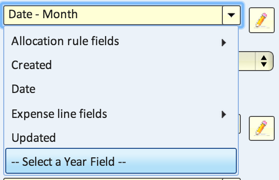
| − | #''Date/Time field'' - defines the x-axis of the timeline. | + | #'''Date/Time field''' - defines the x-axis of the timeline. |
#:''Note: to use an integer field as a Year grouping, click 'Select a Year Field' at the bottom of the drop-down enable picking integers as options.'' | #:''Note: to use an integer field as a Year grouping, click 'Select a Year Field' at the bottom of the drop-down enable picking integers as options.'' | ||
#:[[file:new_timeline4.png]] | #:[[file:new_timeline4.png]] | ||
| − | #''Grouped by'' - | + | #'''Grouped by''' - groups the values along the x-axis. Options are: |
#*Year | #*Year | ||
#*Quarter | #*Quarter | ||
| Line 38: | Line 29: | ||
#*Week (Sunday) | #*Week (Sunday) | ||
#*Week (Monday) | #*Week (Monday) | ||
| − | #* | + | #*Date |
#*Hour | #*Hour | ||
#*Quarter Hour | #*Quarter Hour | ||
#*Exact Time | #*Exact Time | ||
#*[[Binning|Group into Bins]] | #*[[Binning|Group into Bins]] | ||
| + | #'''Secondary Category field''' - (optional) groups the values further. | ||
| + | #'''Value fields''' - populates the values in the timeline. Select value fields by dragging them from the Available Fields into the Value Fields section. | ||
<br> | <br> | ||
| − | == | + | == Display Options == |
| − | |||
| − | |||
| − | |||
| − | |||
| − | |||
| − | |||
| − | |||
| − | |||
| − | |||
| − | |||
| − | |||
| − | |||
| − | |||
| − | |||
| − | |||
| − | |||
| − | |||
| − | |||
| − | |||
| − | |||
| − | |||
| − | |||
| − | |||
| − | |||
| − | |||
| − | |||
| − | |||
| − | |||
| − | |||
| − | |||
| − | |||
| − | + | There are additional display options available to any viewer of the view, available in the view's header: | |
| − | + | [[File:timeline_header.png]] | |
| − | |||
| − | [[ | + | If you change the display options on the view you've written (e.g. setting the view's type to '''Bar''' or '''Line'''), you will set the default for anyone who sees the view. For more information on those options, see [[Using a Timeline Chart]]. |
| − | {{Template:TOC|Visualization| | + | {{Template:TOC|Visualization|Using a Timeline Chart}} |
Latest revision as of 12:27, 8 January 2016
Overview
A timeline chart visualizes data trends and changes over time.

Timelines groups data based on a field representing date or time. This can include:
- Date field (e.g. 2014-01-01)
- Date-time field (e.g. 2014-01-01 00:00:00)
- An integer field representing a year (e.g. 2014)
Creating a Timeline Chart
To create a new timeline chart:
- Navigate to File > New View.
- Select the appropriate data source and table. Make sure the table has at least one date, date-time, or integer field.
- Give the view a name and select Chart - data visualization view.
- Select Timeline.


The new timeline chart will default to grouping the data with the first date, date-time, or integer field available in the data.
Select the following to define the timeline chart:
- Date/Time field - defines the x-axis of the timeline.
- Note: to use an integer field as a Year grouping, click 'Select a Year Field' at the bottom of the drop-down enable picking integers as options.
- Grouped by - groups the values along the x-axis. Options are:
- Year
- Quarter
- Month
- Week (Sunday)
- Week (Monday)
- Date
- Hour
- Quarter Hour
- Exact Time
- Group into Bins
- Secondary Category field - (optional) groups the values further.
- Value fields - populates the values in the timeline. Select value fields by dragging them from the Available Fields into the Value Fields section.

Display Options
There are additional display options available to any viewer of the view, available in the view's header:

If you change the display options on the view you've written (e.g. setting the view's type to Bar or Line), you will set the default for anyone who sees the view. For more information on those options, see Using a Timeline Chart.