A few simple examples of ServiceNow charts using the ServiceNow out-of-the-box demo data. Click on each chart image to see the interactive visualization. For an even more amazing experience, register for the free trial and try the product against your own ServiceNow instance and data.
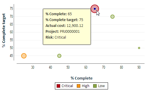
This XY bubble chart shows project progress. Each point (bubble) on the chart represents a project. It compares the percent complete (X axis) to the target (Y axis) thereby allowing you to see which projects are ahead (lower right) and which are behind (upper left). We use color to indicate the risk level and the size of the bubble to indicate the size of the project in terms of cost.
In this example you can see the large bubble at the top representing our largest project and you can see that it's behind its target and has a critical risk as indicated by the color.
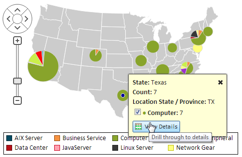
This map chart of the US has a pie chart for each state in which configuration items are located. Each pie shows the number of configuration items broken by class (type).
Click on the chart to interact with it and see how you can zoom, pan, and touch for more details.
Drill through to details is only available to logged-in users, so you are encouraged to register and try it with your data.
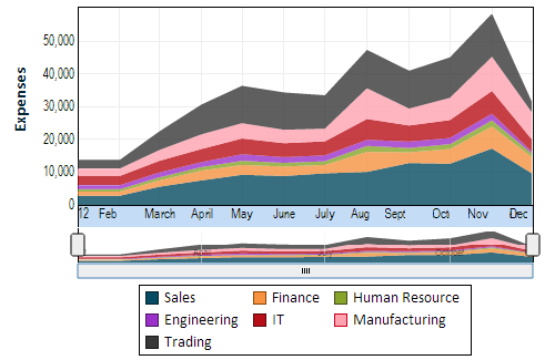
This timeline chart shows monthly dollar expenses by cost center. Using a stacked area representation it's easy to see the trend for each cost center as well as the overall trend. Try switching it to a line or bar chart.
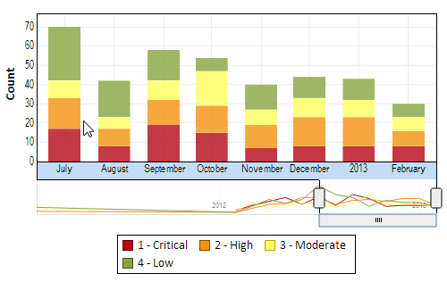
This timeline chart shows monthly data and allows you to scroll through time. In this example we show the latest 8 months. The bars represent incident count for each month broken by priority.
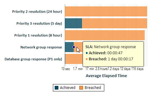
Explore Analytics understands ServiceNow duration fields. In this example, we show the "Average Elapsed Time" field of the SLA (Service-Level Agreement) table by type of SLA (e.g. "Priority 2 Resolution"). We only show Achieved and Breached SLAs and indicate them using different colors.
By using a logarithmic scale we can show durations ranging from seconds to minutes, hours, and days.
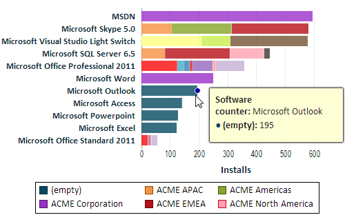
This example uses demo data from the Software Asset Management plugin of ServiceNow. The data in this view is filtered by the model manufacturer of the software.
The bars represent install count from the Software Counter Results table.
You can drill through to details such as the number of licensed units and drill through to the record in ServiceNow. To drill through you'll need to log in.
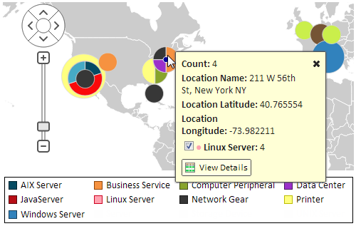
In this example we show the precise location of CIs using longitude and latitude coordinates from the Location table in ServiceNow.
Zoom in to see the precise location. The pie shows the count of CIs in the same location broken down by the type of CI. The radius of the pie represents the relative number of CIs in each location. Thus a larger pie represents more CIs in a location and a small pie (or bubble) represents a location with few CIs.