Scorecard View from a Timeline Chart
Introduction
A timeline chart can feed both the main indicator and the trend (sparkline) indicator of a scorecard view. The latest value of the timeline is displayed as the main indicator and the entire timeline provides the trend.
An Example
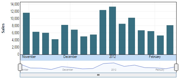
In this example, we have a timeline view showing weekly sales.
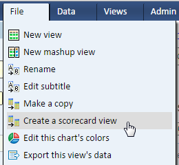
To convert it to a scorecard view, simply select the option from the file menu.
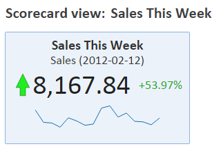
The resulting scorecard is shown below.
The scorecard view is live. Each time you display the scorecard it retrieves data from the data source to show the latest figures as well as the timeline.
All the information in this scorecard is taken from the timeline view. The main indicator is showing the current week's sales. The sparkline is showing the timeline. The secondary indicator and the up/down indicator are based on the percent change between the last point in the timeline (this week's sales) and the previous point in the timeline (last week's sales). In other words, the last two points in the timeline are used to calculate the change.
Important Note
When you create a scorecard from a view, a copy of this view becomes part of the scorecard. Subsequent changes to that view do not affect the scorecard. To make changes to the scorecard you’ll need to edit the scorecard's own copy of the view (called an input view).


