Pivot
The pivot view is a powerful data analysis tool. This page describes the pivot view and how to use it to analyze your data.
Contents
- 1 What's a Pivot?
- 2 Why is it called a Pivot?
- 3 The Structure of a Pivot View
- 4 Terminology
- 5 Selecting Fields
- 6 Working with Dates
- 7 Subtotals
- 8 Grand Totals
- 9 Sorting
- 10 Additional Calculations: Display As
- 11 Calculated Values and Calculated Columns
- 12 Drill Through to Details
- 13 Drill Down
- 14 Animation / Page-Level
- 15 Filling Missing or Empty Categories
What's a Pivot?
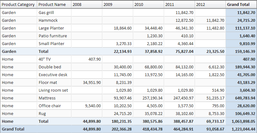
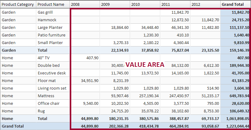
A pivot view is a table that shows summarized numerical data grouped by multiple categories. Let’s review an example of a pivot table showing Product Sales by Category and Year.
In this view, we summarize data by three category fields:
- Product Category – category labels are listed in the rows: "Garden” and "Home"
- Product Name – category labels are listed in the rows: "Gas grill", "Hammock", etc.
- Year – year labels are listed in the columns (across the top): "2008", "2009", through "2012"
The numerical values being summarized is the sales amount.
Why is it called a Pivot?
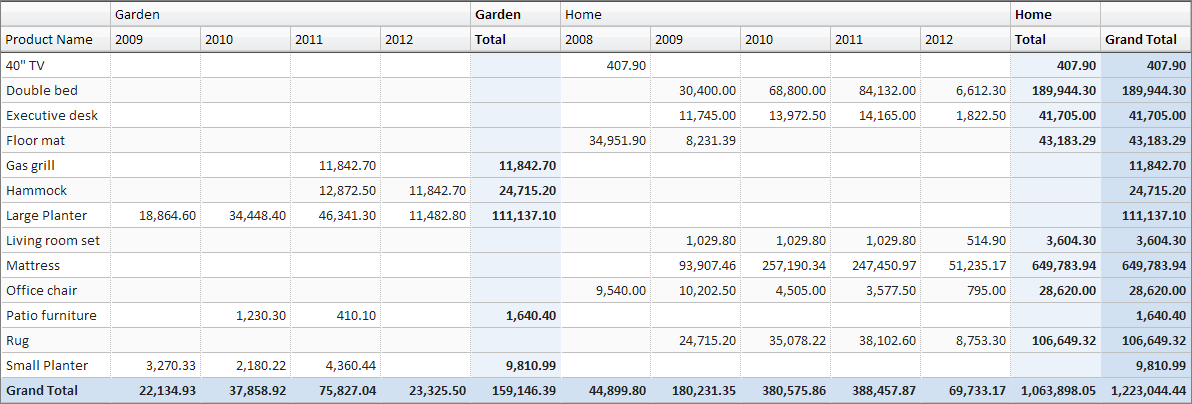
When you work with a pivot view, it’s easy to move categories from the rows (listed down the side on the left) to the columns (listed across the top) and vice-versa. You can think of it as a pivoting action centered on the top-left corner of the view. Let’s continue with our example. Let's move the "Product Category" to the columns (above the year). Now "Garden" and "Home" are listed left-to-right instead of top-down.
The Structure of a Pivot View
A pivot view consists of the following three areas:
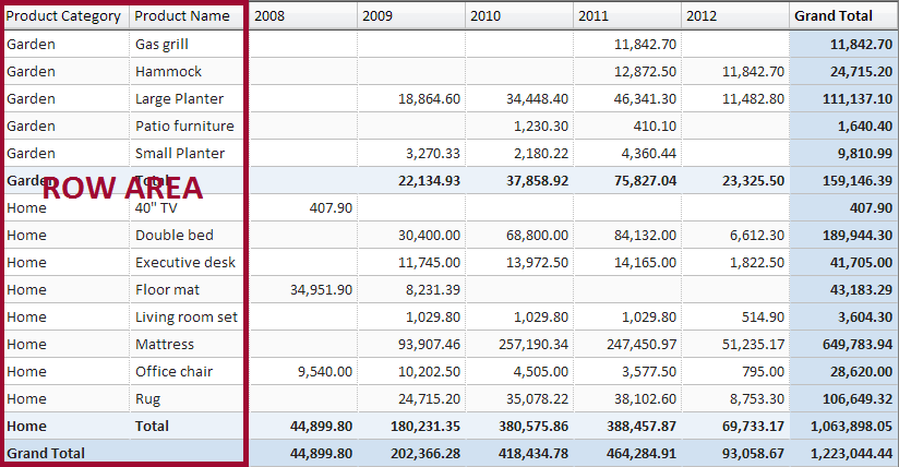
- Row Area – holds categories that are listed in the rows (down the side on the left). The row area can have multiple fields (two in our example). Each field provides its set of labels.
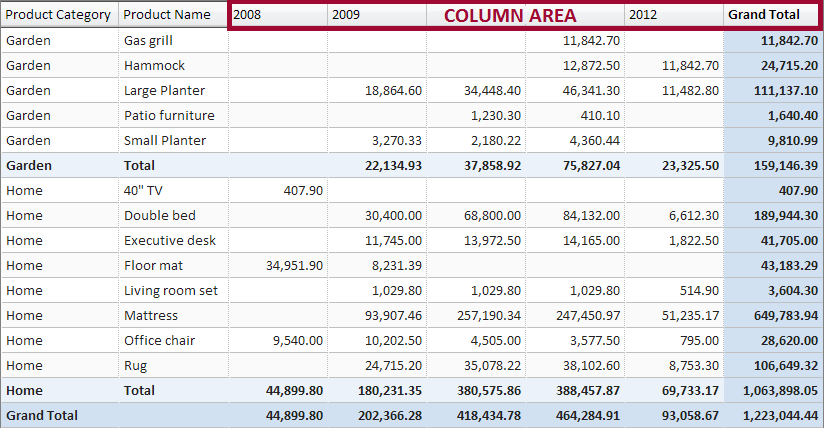
- Column Area – holds categories listed in the columns (across the top). The column area can have multiple fields. In the previous example when we moved the product category to the column area we saw two fields in the column area.
- Value Area – holds numeric amounts such as sums or counts. As we’ll see later, the value area can have multiple fields, allowing us to show multiple numeric calculations such as sums, counts, or averages.
The three areas are depicted in the following:
Row Area
Column Area
Value Area
Terminology
- Row Labels/Row Fields - A data field that provides category labels to be listed in the row area of the pivot
- Column Labels/Column Fields - A data field that provides categories to be listed in the column area of the pivot
- Values/Value Fields - A data field that is aggregated (counted, summed, averaged, etc.). These aggregated values are displayed in the value area. When a pivot view has more than one value field, we get another category that labels these fields. For example "Count" (count of sales) and "Sales" (sum of sales amount). These labels can go in the row area or the column area. A special field called "Values" allows you to place these labels in the row or column area. When a pivot view has just one value field, the special "Values" field is hidden as it is not applicable.
Selecting Fields
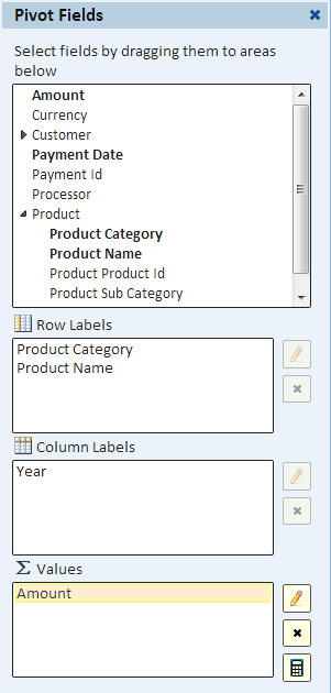
To select fields for the row, column, or value area use the "Choose Fields" button to display the "Pivot Fields" dialog in the sidebar.
In the Pivot Fields dialog, you select fields by dragging them from the fields list at the top to one of the areas below. You can also drag fields between and within areas to order them.
A field can be selected for the row or column areas only once (only one or the other). However, you can select a field to the value area multiple times. This is useful for showing different aggregates of the same fields.
Working with Dates
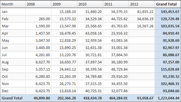
Dates are hierarchical in nature with months nested in quarters which themselves are nested in years. The pivot view allows you to group data by months, quarters, and years, show subtotals at every level and event put these parts of the data in different areas as we see in the next example:
In this example, it's easy to compare sales in a particular month to sales in the same month in other years.
Editing Field Settings
To edit settings for any field, first click (or touch) the field to highlight it, then use the "Edit Settings" button (the button with the pencil icon).
Depending on the field and the area you'll have various options, including changing the field label.
Selecting Date Parts
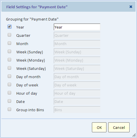
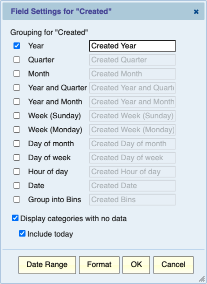
When you drag a date/time field to the row or column area, it turns into a "Year" field. To select "Quarter" and "Month" and to change the labels use the Field Settings dialog.
ServiceNow grouping by week
For a ServiceNow data source, the choice of the first day of the week, Sunday or Monday, is controlled by a ServiceNow system property - "glide.ui.date_format.first_day_of_week" and by default it considers the week as beginning on Monday. This ServiceNow property can be set to "1" to indicate Sunday as the first day of the week. It means that in most cases, it will group based on the ServiceNow property, not based on your selection here.
Subtotals
You can add or remove subtotals for a row or column field provided that it's not the inner-most row or column field. Subtotaling the inner-most field is unnecessary because there's always a single value.
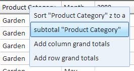
You can add or remove a subtotal using a right-click (or touch) on the corresponding column heading and making the appropriate selection.
Grand Totals
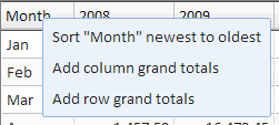
You can add or remove grand totals using a right click (or touch) on a column heading and making the appropriate selection.
Sorting
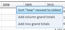
The pivot is naturally sorted to achieve its grouping. It's first sorted by the row areas field in order and then sorted by the column area fields. Although this order should not be changes, you can still control the sort direction. For example, to list the year in descending order, select "Sort "Year" newest to oldest" from the column heading right-click (or touch) menu. That would list "2012", then "2011", etc.
Sorting by Value
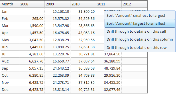
It is often useful to depart from the normal sort and order the pivot rows based on the numeric values. For example, we can show the month with the greatest sales amount in the year 2011 at the top.
A few important things to point out:
- When we sort by value, we can only sort in columns (vertically) and not horizontally. If you want to sort the other way, you should first pivot the relevant categories to the rows and then sort vertically.
- When we sort by value, we sort based on the values of a particular column, in our example, "2011".
- To turn sort by value off and return to the normal sort, use the procedure in the "Sorting" section above.
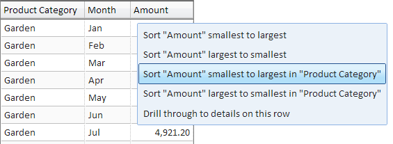
- If there are no fields in the column area and there are multiple fields in the row area, then there are two options for sorting by value: You can sort the entire column (e.g., "Sort "Amount"), and you can sort in a particular category (except the inner-most category), for example you can sort within product category by selecting "Sort "Amount" ... in "Product Category".
Additional Calculations: Display As
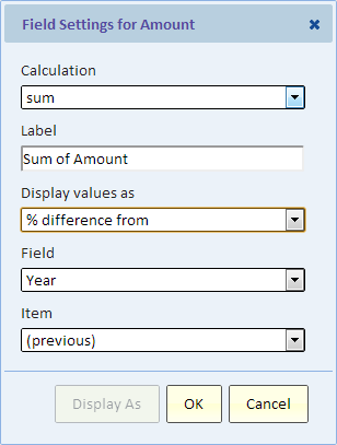
On top of the aggregate calculations listed above, you can apply additional calculations such as running totals. The aggregate calculations are performed first. The "Display As" calculations are performed on the results of the aggregate calculations.
For full description on the Display As functionality, see Working with Values.
Calculated Values and Calculated Columns
To create new pivot columns that display calculations based on data in the pivot, please see the page about Calculated Values and Calculated Columns.
Drill Through to Details
In a pivot table, every non-empty value-area cell represents a set of records. These records are selected by the labels of the column area shown directly above the cell (column headings) and the labels of the row area shows directly to the left of the cell (row labels).
A drill-through action displays a list of these records.
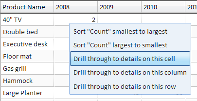
To drill through, click, (or touch), a cell and then select one of the following kinds of drill-through.
- Details on this cell - displays the records that contribute to the value of this cell.
- Details on this row - displays the records that contribute to all the values in the row of the cell.
- Details on this column - displays the records that contribute to all the values in the column of the cell.
For more information, see the page Pivot Drill Through to Details.
Drill Down
A drill down action updates the view by adding a level of details. A "focus and drill down" action, filters data down to the selected category and replaces the selected field with the next field in the drill-down hierarchy. This is useful for understanding the current value by further breaking it down.
Drill down is available when a drill-down hierarchy is defined for this field. See the page Drill Down for details about setting up drill down.
Animation / Page-Level
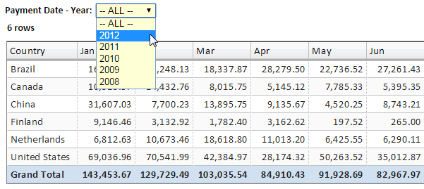
An animation field, also referred to as a page-level field, can add another dimension to your pivot. If you think of the pivot table like a page, then you can turn it into a book with a page for each category of the animation field. For example, if you have a pivot with monthly sales, and you set the animation field to be the year, you can use the animation drop down to select the year.
We refer to the page-level field as the animation field because the same feature in a chart view is used for animating the chart.
To edit the animation field, use the "Animation" button to call up the Animation Dialog.
In the animation dialog, you can select the animation field, give it a label, select date-time grouping, defining binning, and more. You can also request an "All" page as the first animation page. This page summarizes all the pages that follow.
Animation Default Value
When you make a selection using the animation drop-down, that selection is saved and serves as the default selection going forward.
Published View Default Animation Value
To set the default value for a published view, simply make the selection before publishing the view. When the view is published, a copy of the view is created including any saved animation field default value. Once published, the view is "read-only" and selection made on the animation drop-down are not saved.
Filling Missing or Empty Categories
When creating a report based on categories, certain categories may not be displayed simply because they don’t occur in the data. For example, if incidents are ranked by priority, P1 through P5. A weekly report may have no priority-1 incidents (P1) simply because there was no P1 incident this week. For another example, a report of sales by day of the week may be missing Tuesday simply because there were no sales on Tuesday.
In such cases, you may want to add the missing categories to your report to make the report more complete and make the fact that there were no incidents or no sales explicit by showing a zero.
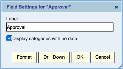
Displaying Categories With no Data
In a Pivot or Chart report, you can request that categories with no data will nonetheless be displayed. This would address the needs that we saw in the two examples above. This feature is available for category fields such as pivot row, column or animation fields, when the field is a date field, a field of type Choice, or a category field created by Binning. For such fields, you can use the field settings dialog and check the box "Display categories with no data".
When you make this selection, another selection is automatically made, “Display empty values as zero”. This option is described below.
Date Fields
When you group dates by year, week, or day, the set of missing categories needs to be defined. Obviously, any categories between the earliest and latest value in the report. For example if the report has Monday and Wednesday and is grouped by day, then a category for Tuesday is added. However, suppose the latest value is before today and you still want to show today in the report even if nothing happened today. For this purpose, another checkbox is available for date/time fields when you select to display categories with no data. The checkbox is “Include today”
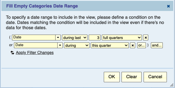
If you need to be more specific about what dates to include in your report, you can use the “Date Range” button and define a date range. For example the last 3 full quarters plus this quarter.
Display empty values as zero
A related feature when adding missing categories is to display values as zero rather than blank. This feature can be used at any time, but it’s the default when displaying categories with no data.
Limitations
Displaying categories with no data is not supported in certain cases:
- When the data is sorted by value rather than by category
- When you are grouping by quarter and month, displaying all the months doesn’t work because you’d get 12 month under each quarter. Another such example is grouping by week and date and trying to fill missing dates.
Filling Missing Categories Can be Inappropriate
Not having data for a certain category can be either because things didn’t happen, for example there were no sales or no incidents. But lack of data may also be because data is simply not available. In that case, showing zero is misleading because we don’t actually know. For example, if I uploaded data for last year, showing a zero for the current year is wrong. We can only show information for this year if we actually have the data for this year.
