Incidents and Outages
Contents
Introduction
In this short tutorial, you'll learn how to create a mashup view of two timeline charts. As you'll see in this example, we can bring data from multiple sources together into a single presentation. Through this example, you'll learn to use the powerful feature that we call Mashup View.
The desired view
We would like to show in a single view a weekly timeline of helpdesk incidents and service outages. We would like to see whether occurrences of service outages can explain spikes in incident activity. In our data source, we cannot obtain both numbers in one query. This is because the outage table is not directly related to the incident table.
Creating the Incidents and Outages Timeline
We will create the desired timeline as a mashup view of two timeline charts. Therefore, our first step is to create each timeline chart. The mashup is created later, once we have the two input charts. The first chart indicates the weekly number of service outages. The second chart indicates the weekly number of helpdesk incidents. In both charts, the date/time field is grouped by week.
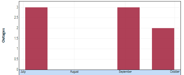
The first chart looks as follows:
You can see that we had three outages during the week of July 8, three outages during the week of September 2, and two outages during the week of September 23.
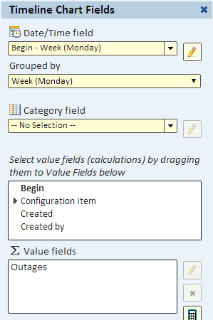
To see how we defined this timeline, let's review the Fields dialog. You can see that we grouped the outage "Begin" field by week and selected a value field (a count) and named it "Outages". Naming it this way will distinguish it from the count of incidents.
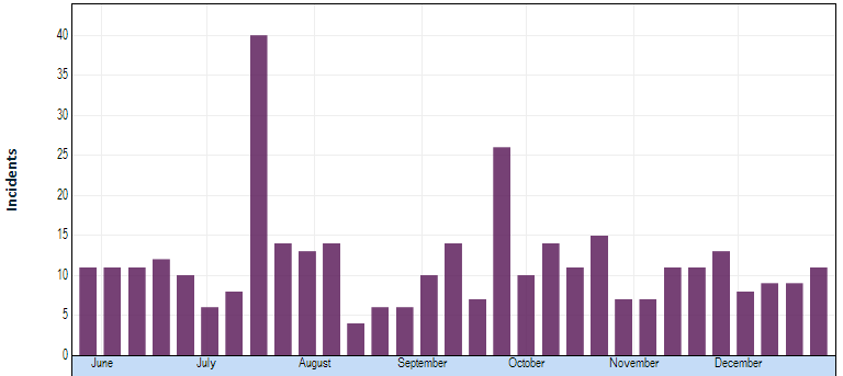
For the second view, we create a timeline of incidents.
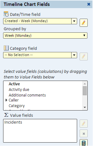
To see how it's defined, here's its Fields dialog. Here we grouped the incident created time by week and named the value field that has the count of rows "Incidents".
Creating the Mashup
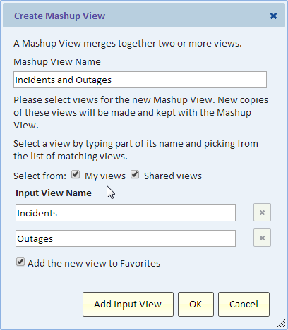
Now that we have the two inputs, we can create the mashup view using the "New mashup view" dialog.
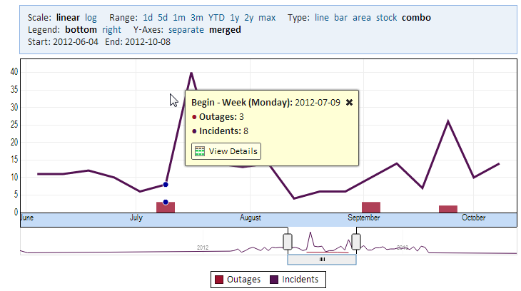
The result is shown in the following image. The chart header allows us to merge the Y axis of the two views and we also selected a "combo" as the type.
