Category Chart
Overview
A category chart visualizes data by category for easy comparison. A category chart can visualize using a bar, pie, or donut chart.
Type
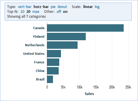
'Bar Chart' allows easy comparison of values for categories. You can show more than one value for each category. Such values will be color-coded and a legend will be displayed. If applicable, you'll have the option to stack that bars for multiple values for each category, or show them side-by-side.
- vert-bar - a vertical bar chart can show more bars
- horz-bar - a horizontal bar chart allows more space for labels for each bar
'Pie and Donut Charts' visualize values for categories as portions of the whole.
- pie - a pie chart
- donut - a donut chart
Secondary Category
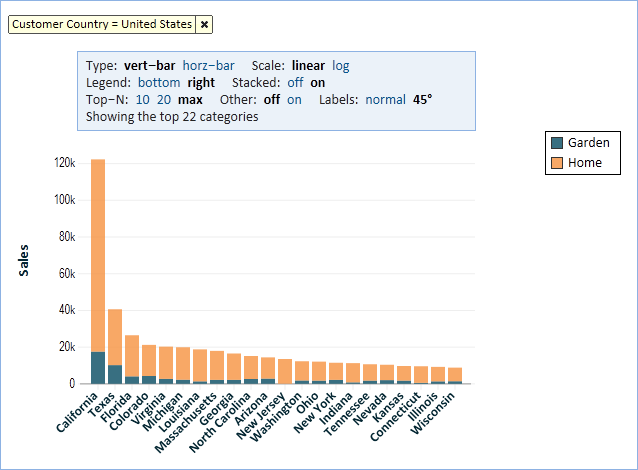
A secondary category can provide more detail for each category. In the example below, we show Sales in each US State further broken down by Product Category. In this case we used a vertical bar chart and we stacked the bars. Stacking the bars allows us to compare the totals for the states while also breaking them down by product category.
Labels
In vertical bar charts, the space for labels below the chart is limited. Explore Analytics will automatically rotate the labels by 45 degrees. It can also show labels in two rows where every other label is in the lower row. You can control this using the Labels option in the chart header.
Top N
Rather than show all categories, you may restrict the chart to only showing the first "N" categories. "N" can be 10 or 20, or max to show as many as can fit in the space of the chart. When showing fewer than all categories, you have an option of showing an "Other" category that aggregates the remainder categories. Note that when your chart is showing average values, it is not possible to aggregate such averages into the "Other" category.
Pie / Donut
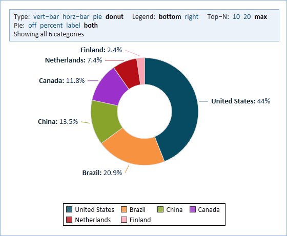
For data that consists of non-negative numbers that add up to a whole, we can visualize using a Pie or Donut Chart. For example, Sales data for each country is normally positive and adds up to global sales. It makes sense to talk about the percentage of sales that each country contributes. This is easy to see in the following chart.
Color
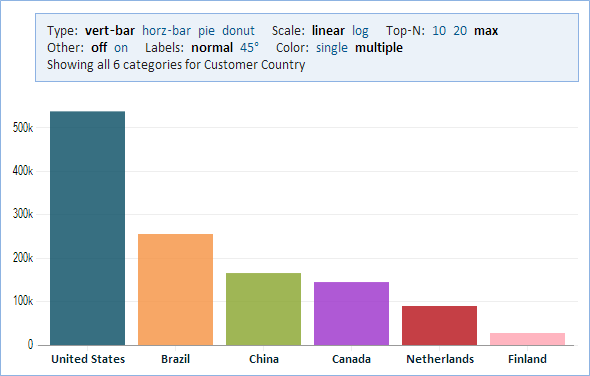
For a single-category bar chart, you have a choice between using a single color (the default), or assigning a separate color for each category (similar to a pie chart). You can see the results of applying separate colors in the following image. You can edit the color assignments.


