If you’re like me, then you want to keep on top of what’s going on. You want to identify problems and opportunities early, and you want to do so analytically.
An analytical solution gives you a wealth of reports and dashboards. You could start your day by reviewing this information. Alas, after a few days you discover that you don’t really have the time to review all those beautiful reports on a daily basis. You need something more proactive. You need alerts!
Alerts are not a new idea, but they are as important as ever. News alerts can tell you when your company is in the news. Stock alerts can tell you if your favorite stock is on the move. The same idea is true for your business analytics.
Turning Reports into Alerts
Consider these simple steps for converting any report, pivot, or chart into an alerting tool.
- Define a threshold and only display information that crosses that threshold.
- Schedule the report to text or email you the output only if it has any data.
If you pick the right threshold, you’ll only get a text or email when your attention is needed. For example if there’s a significant change from the previous day, if a commitment was breached, or a key indicator crossed a threshold.
Let’s look at a few examples:
- You’re about to breach your service-level agreement
- There’s been a drop in performance with significantly longer wait times
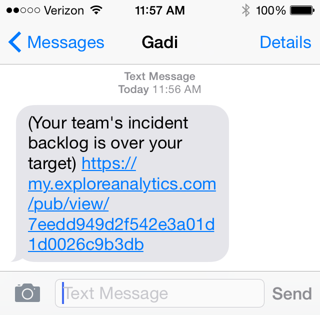
- Your team’s backlog went above your target limit
Implementation
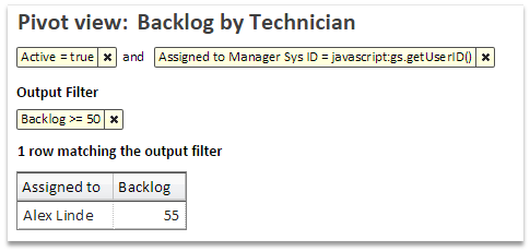
Using Explore Analytics, you can define an output filter. An output filter looks at the output of the report with its aggregated and calculated values and selects only the items that meet the filter selection. For example, if the report summarizes the backlog for each of your team members, the output filter can select members with a backlog of over 50 support tickets. On most days, this report will be empty. When the report is not empty, you’d like to be alerted.
The second step in our implementation using Explore Analytics, is the alerting. We do that by scheduling this report and requesting that it be sent only if it’s not empty.
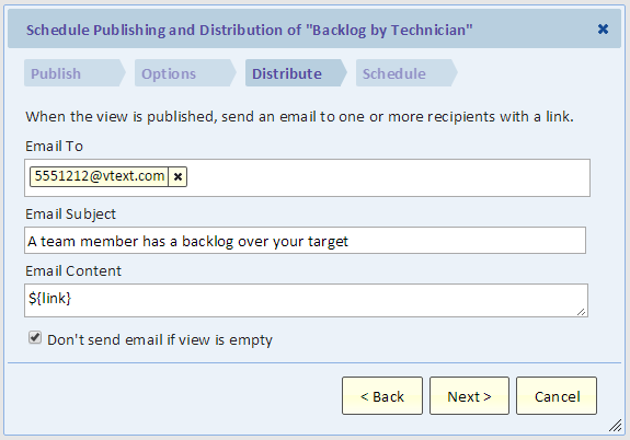
A couple things to note in the dialog:
- The email address @vtext.com allows you to send an alert as a text message (SMS) to your phone. The address depends on your mobile carries (the example is using Verizon).
- The checkbox at the bottom of the dialog means that you will only get the text message if there’s at least one team member with a backlog over 50.
Picking the Alert Threshold
What you want is a text or an email saying “hey, something is going on, you need to take a look.” The message should include the information so that you can immediately act on it.
Therefore, when picking the threshold, consider:
- Is it actionable? If you’re not going to act on it, then don’t send it.
- With alerts, you’re looking for exceptions. If you’re going to get the alert every day, then it’s not an exception and you’re likely to say “we should really do something about it” and promptly ignore it.
- Don’t overwhelm yourself or your team members with too many alerts. Pick the really important ones or set the threshold higher. Let your team members define their own alerts.
Conclusion
Analytical alerts allow you to focus on exceptions and opportunities and proactively manage them. Information is actionable and you can immediately take action or delegate to the right person to take action.


